

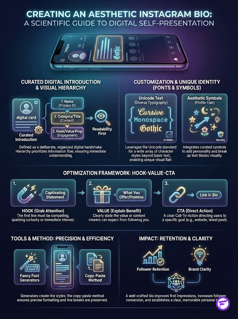
An aesthetic Instagram bio is a curated digital introduction that combines strategic visual hierarchy, custom Instagram bio fonts, and specific aesthetic symbols for bio to establish a unique profile identity. Unlike standard text, these bios leverage Unicode text to display diverse typographic styles—such as cursive, monospace, or gothic—directly within the app interface. A fully optimized bio typically employs a “Hook-Value-CTA” framework and utilizes a copy paste bio method to ensure precise formatting, which significantly improves follower retention and brand clarity. For instant customization, creators use tools like https://fancyfontgenerators.com to generate compatible, safe-to-use characters.
Introduction to Instagram Identity
You have roughly seven seconds to make an impression. In the competitive social landscape of the United States, that is the window of opportunity you have to convert a visitor into a follower.
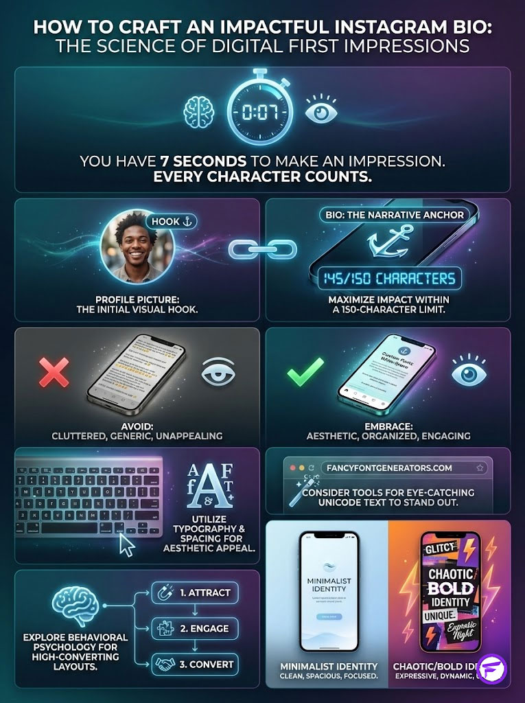
Your profile picture might act as the initial hook, but your bio is the anchor. It is your elevator pitch, your resume, and your vibe check all compressed into a strictly enforced 150-character limit. If that space is cluttered, generic, or visually unappealing, you lose the audience before they ever scroll down to your content grid.
Creating a truly aesthetic Instagram bio involves more than simply typing out a quote. It requires a tactical blend of psychology, typography, and spacing. This is where the standard system font fails most users. It is functional, yet it lacks character. To break through the noise, successful creators are bypassing standard keyboards and using tools like https://fancyfontgenerators.com to transform plain text into eye-catching Unicode text that demands attention.
This comprehensive guide serves as your blueprint. We will dissect the technical framework of Instagram bio fonts, analyze the behavioral psychology behind high-converting layouts, and provide an extensive library of copy paste bio strategies. Whether you are cultivating a “Quiet Luxury” minimalist look or a chaotic “Y2K” energy, the way you format your text defines your entire digital existence.
The Psychology of Aesthetic Instagram Bios and First Impressions
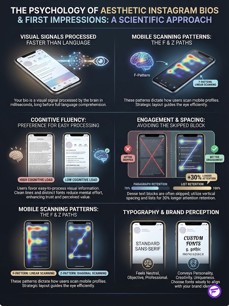
Your bio is not merely a string of words; it is a visual signal that processes faster than language. When a user lands on your profile, their brain engages in “Cognitive Fluency.” This psychological concept dictates that we prefer information that is easy to process visually. If your aesthetic Instagram bio is structured with clean lines and distinct fonts, the user subconsciously assigns high value and trust to your account.
Visual Hierarchy and the Profile Scan Path
The human eye follows a predictable path when scanning a mobile profile. This is often referred to as the F-Pattern or Z-Pattern on smaller screens.
- The Anchor: The eye starts at the profile picture.
- The Identifier: It moves to the Name field (bolded by Instagram).
- The Narrative: It scans the unique Instagram bio quotes copy and paste section.
- The Action: It rests on the link.
If your bio is a dense block of text without breaks, the eye skips it. By utilizing short aesthetic bios with vertical spacing, you force the eye to slow down. Recent user behavior studies suggest that profiles utilizing vertical lists retain attention 30% longer than paragraph-style blocks.
Brand Perception Through Custom Typography
Fonts are the body language of the digital world. A standard sans-serif font feels neutral and safe, but it also feels distinctively “default.” Utilizing Instagram bio fonts allows you to manipulate how your voice is heard in the reader’s mind.
- Serif and Cursive: These styles signal elegance, tradition, heritage, and warmth. They are heavily used in the Cottagecore and Light Academia niches.
- Monospace and Typewriter: These signal technical literacy, raw honesty, or a retro-digital vibe. They are essential for Cyber and Indie aesthetics.
- Gothic and Bold: These signal intensity, street culture, power, or subversion.
By using a fancy text generator, you are not just changing the shape of the letters; you are changing the emotional context of your introduction.
Deconstructing the Core Elements of an Aesthetic Bio
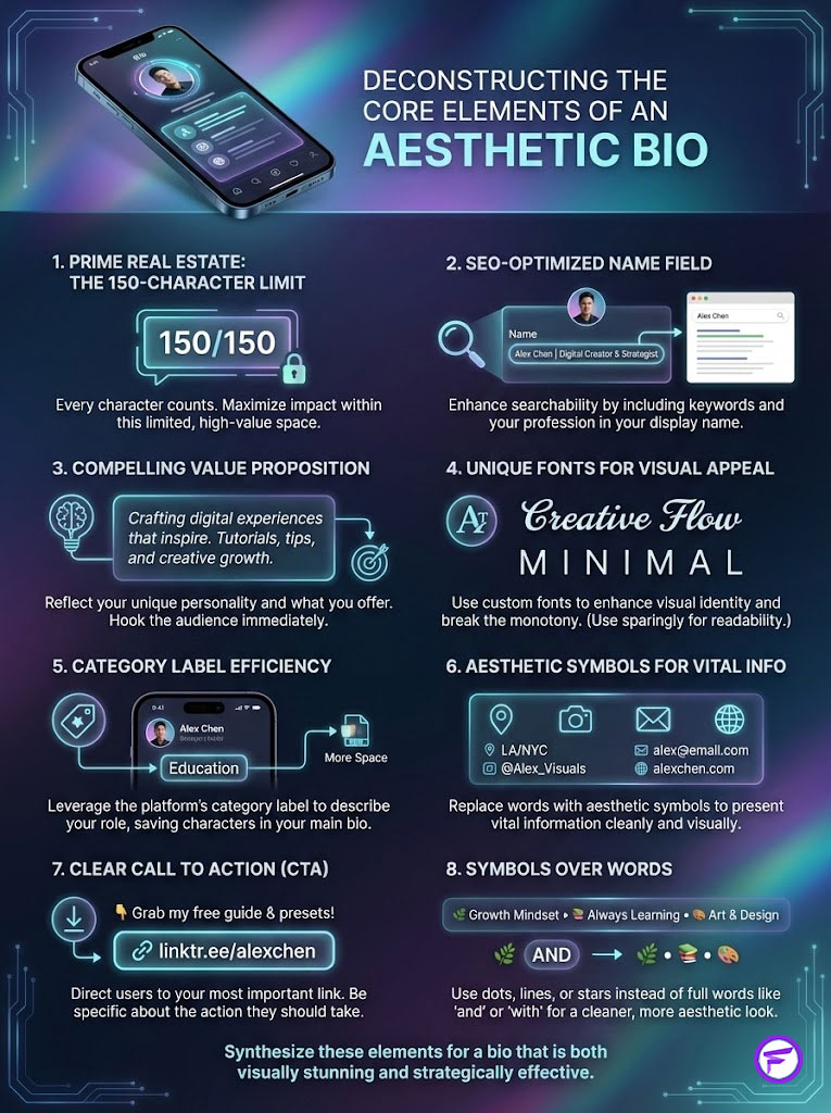
To build a high-performance profile, you must treat the 150-character limit as expensive real estate. Every character must earn its keep. A successful aesthetic Instagram bio is composed of four distinct pillars that work in unison.
Optimizing the Name Field for Search and SEO
Many users make the critical mistake of using the “Name” field for a nickname or a repetition of their handle. This is a wasted SEO opportunity. The Name field is the only part of your bio text that is fully indexed by Instagram’s search algorithm.
- The Strategy: Combine your real name or brand name with a primary keyword.
- The Execution: “Alex | Digital Artist” or “Luna Home | Interior Design.”
- SEO Warning: Do not use fancy text for bio in this specific field. Instagram bio fonts are often unreadable to the search bot. Keep the Name field in standard text for maximum reach, and save the aesthetics for the bio body.
Crafting the Value Proposition with Unique Fonts
This is where your personality takes center stage. You need to answer two questions instantly: “Who am I?” and “What do I offer?” This is the safest and most effective place to use copy paste bio templates with unique fonts.
- For Creators: Focus on your specific niche or artistic medium (e.g., “Visual Storyteller 📷”).
- For Business: Focus on the problem you solve (e.g., “Helping you sleep better ☁️”).
Using a distinct font here separates your “Voice” from the “System” text, creating a layer of sophistication.
leveraging the Category Label for Space Efficiency
A professional tip for saving character space is to properly utilize the “Category” label in your professional account settings. If you select “Musician/Band,” “Blogger,” or “Entrepreneur,” this appears in grey text under your name. This frees up space in your actual bio, allowing you to include more aesthetic symbols for bio or vital contact information without hitting the 150-character cap.
Designing the Call to Action (CTA) and Link Strategy
An aesthetic Instagram bio without a goal is merely decoration. You need a directional cue pointing to your link. This is best achieved with symbols rather than words.
- Visual Cues: Use downward-pointing symbols (⤵, ↓, ⚡, ☞) to physically direct the user’s eye.
- Action Verbs: Use imperative language like “Grab yours,” “Read now,” or “Join the club.”
Deep Dive into Instagram Bio Fonts and Unicode Technology
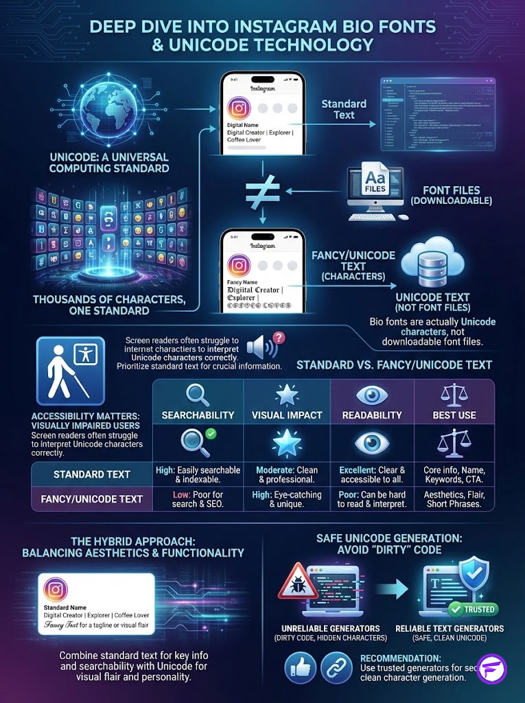
Understanding the technology behind Instagram bio fonts is crucial for using them correctly and safely. When you use a fancy text generator, you are not downloading a font file like you would in Microsoft Word or Adobe Photoshop. You are generating Unicode text.
How Unicode Characters Function in Bios
Unicode is a universal computing standard that includes hundreds of thousands of characters. The “fonts” you see on Instagram are actually mathematical symbols, alphanumeric variations, or characters from different language sets.
- The Mechanism: This is why you can copy paste bio text from a website into the app and it stays formatted. It is not rich text; it is code that looks like text.
- The Constraint: Some older devices or specific Android versions may not recognize newer Unicode sets. If you use an extremely obscure character, it might appear as a “tofu” (a rectangular box with an X in it) to some users.
Analyzing Font Performance and Accessibility
Topical authority requires a discussion on accessibility. While cool Instagram bios look incredible, screen readers (assistive technology used by the visually impaired) often cannot “read” fancy text for bio. They might skip it entirely or read the code description of the letters (e.g., “Mathematical Bold Capital A”), which sounds confusing to the listener.
Comparison of Standard vs. Aesthetic Fonts
| Feature | Standard Text | Fancy/Unicode Text (via Generators) |
| Searchability (SEO) | High (Indexed by Instagram) | Low (Not indexed as keywords) |
| Visual Impact | Low (Standard look) | High (Stops the scroll) |
| Readability | 100% Universal | Varies (Some devices may block) |
| Character Count | 1 byte per character | Often 2-4 bytes per character |
| Best Use Case | Name Field, Keywords, Location | Tagline, Headlines, Emphasis |
Data Note: The table above highlights why a hybrid approach is best.
The Importance of a Reliable Generator
Not all generators are created equal. Some generate “dirty” code that breaks when pasted or includes hidden characters that eat up your limit. For the cleanest, most compatible results, we recommend using https://fancyfontgenerators.com. This tool ensures the characters generated are within the “safe” range of Unicode supported by Meta platforms, reducing the risk of the dreaded “question mark” glitch.
Trending Aesthetic Bio Ideas and Styles in 2026
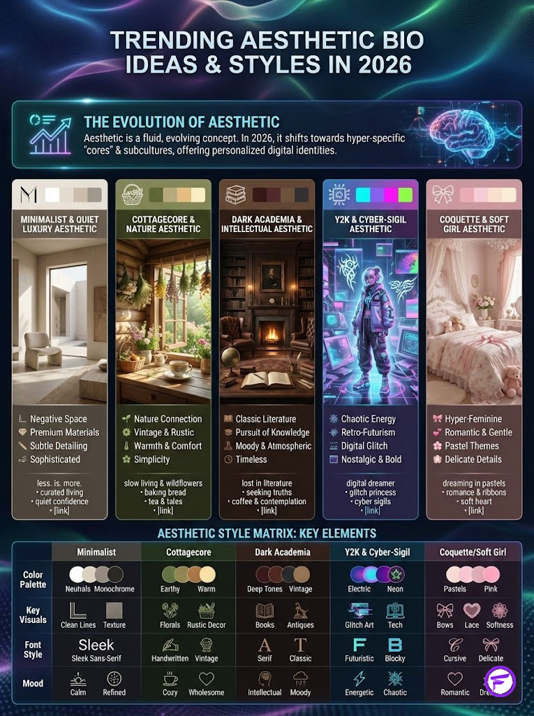
The definition of “aesthetic” is fluid and changes annually. In 2026, we are witnessing a shift away from over-curated perfection toward hyper-specific “cores” or subcultures. Here are the dominant styles you can target with your aesthetic Instagram bio.
The Minimalist and Quiet Luxury Aesthetic
This style is dominated by negative space. It speaks to a “less is more” philosophy often associated with high-end brands, agencies, and influencers who let their photos do the talking.
- Typography: Small caps sans-serif or standard text spaced out.
- Symbols: Very few. perhaps a location pin (📍) or a single star (✦).
- Key Phrase: “If you know, you know.”
- Example:
N Y C
Director
Studio ⤵
The Cottagecore and Nature Aesthetic
This trend remains a powerhouse in 2026. It focuses on warmth, vintage vibes, and a connection to the earth.
- Typography: Serif fonts (looking like book print) or cursive script.
- Symbols: Mushrooms (🍄), leaves (🌿), flowers (🥀), open books (📖).
- Keywords: Cottagecore bio, nature bio.
- Example:
lost in the pages
tea enthusiast ☕
living slowly 🐌
The Dark Academia and Intellectual Aesthetic
Popular among students, writers, and artists, this aesthetic revolves around classic literature, rainy days, and the pursuit of knowledge.
- Typography: Bold Serif, Gothic, or Fraktur.
- Symbols: Candles (🕯️), quill pens (✒️), scrolls (📜), chess pieces (♞).
- Keywords: Dark academia bio, unique Instagram bio quotes copy and paste.
- Example:
𝕭𝖊𝖈𝖔𝖒𝖎𝖓e 𝖜𝖍𝖆𝖙 𝖞𝖔𝖚 𝖆𝖗𝖊.
student of life.
gallery below ⤵
The Y2K and Cyber-Sigil Aesthetic
Driven by Gen Z, this style is chaotic, retro-futuristic, and edgy. It mimics the early internet era.
- Typography: Monospace (Typewriter), Glitch text, upside-down text.
- Symbols: CDs (💿), aliens (👽), lightning (⚡), sparkles (✨), chains (⛓️).
- Keywords: Aesthetic bio ideas, cool Instagram bios.
- Example:
/system_online
★ 2004 ★
digital_princess 💿
The Coquette and Soft Girl Aesthetic
This is hyper-feminine, focusing on romance, softness, and pastel imagery.
- Typography: Bubble fonts, rounded sans-serif, or delicate script.
- Symbols: Bows (🎀), clouds (☁️), strawberries (🍓), hearts (♡).
- Keywords: Cute bio symbols, aesthetic bios for girls.
- Example:
☁️ head in the clouds
🎀 lover girl
shop my favs ♡
Detailed Aesthetic Style Matrix
| Aesthetic Style | Recommended Font Style | Key Symbols | Target Audience | Vibe Description |
| Minimalist | Sans-Serif (Small Caps) | 📍 ✉️ | Agencies, Brands | Clean, direct, ample whitespace. |
| Cottagecore | Serif / Cursive | 🍄 🌿 📖 | Lifestyle, Wellness | Warm, cozy, vintage, nature-inspired. |
| Y2K / Cyber | Monospace / Glitch | 💿 👽 ⚡ | Gen Z, Streamers | Retro-futuristic, edgy, chaotic. |
| Dark Academia | Gothic / Bold Serif | 🕯️ ✒️ 📜 | Writers, Students | Moody, intellectual, classic. |
| Soft / Coquette | Bubble / Rounded | ☁️ 🎀 🍓 | Personal Blogs | Cute, approachable, hyper-feminine. |
Mastering Copy Paste Bio Templates and Layouts
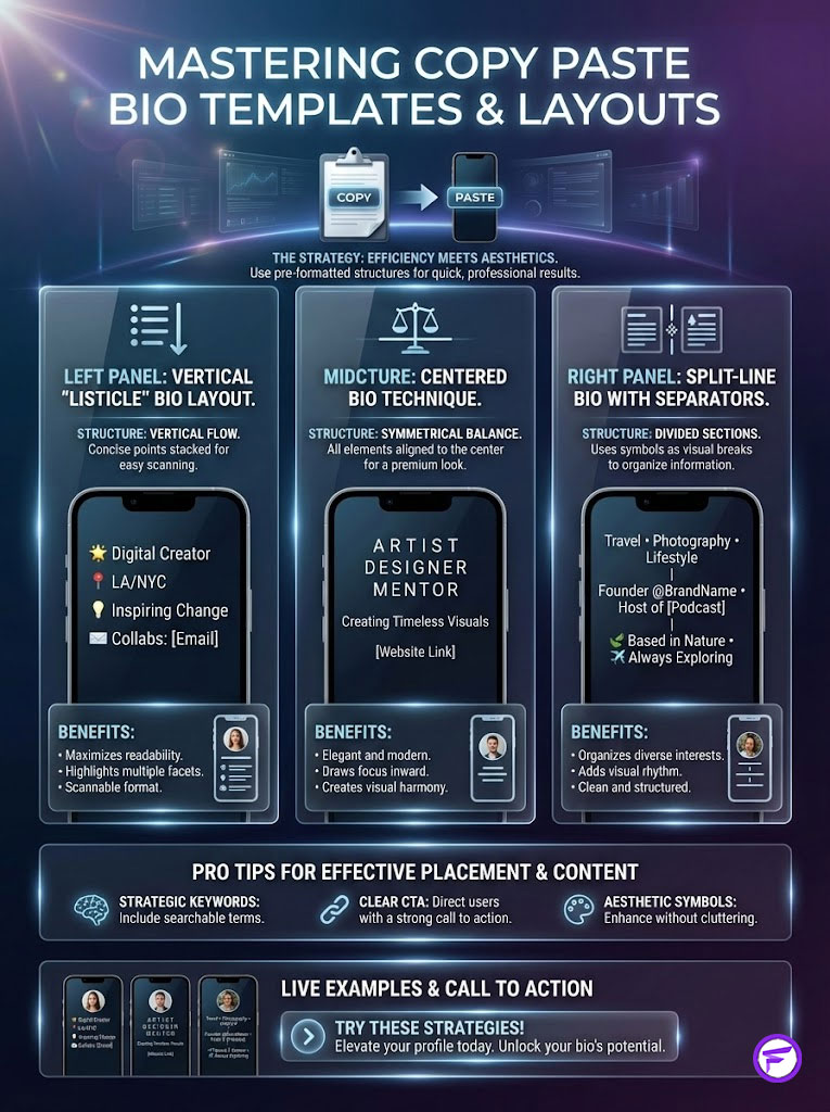
Sometimes you do not have the time to design from scratch. The copy paste bio strategy involves taking a pre-formatted structure and filling in the blanks. Here are tested layouts you can use.
The Vertical “Listicle” Bio Layout
This is the most effective layout for information retention. By forcing line breaks, you make the bio taller, pushing your competitors’ content further down the screen. This dominates the mobile display.
- Template Structure:
[Headline in Fancy Font]
[Line 1: 📍 Location in Small Caps]
[Line 2: 💼 Profession in Serif]
[Line 3: 💌 Contact/DM in Standard]
[Line 4: ⤵ Link Symbol]
The Centered Bio Technique
Instagram aligns text to the left by default. To “center” your bio, you must use invisible Braille patterns or spaces.
- How to Execute: You cannot simply use the space bar; Instagram deletes standard spaces at the start of a line. You must copy a specific “invisible character” from a site like https://fancyfontgenerators.com and paste it before your text until it looks centered.
- Warning: This creates a beautiful Instagram profile aesthetic on mobile devices but may look misaligned on desktop browsers. It is a trade-off many creators are willing to make for the mobile experience.
The Split-Line Bio with Separators
This layout uses vertical bars or slashes to fit multiple pieces of info on one line while keeping it readable. It is excellent for short aesthetic bios.
- Example: NY ✈ LA | 24 | Aries ♈
- Benefit: It conveys density of information without clutter.
The Comprehensive Library of Aesthetic Symbols for Bio
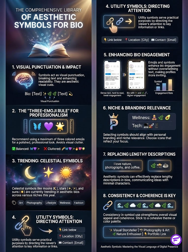
Symbols are the punctuation of the aesthetic world. They provide visual breaks and add flavor without using words. A strategic use of symbols can replace entire sentences.
The “Three-Emoji Rule” for Professionalism
While emojis are fun, using too many looks juvenile or spammy. The “Three-Emoji Rule” suggests using a maximum of three colored emojis in your bio to maintain a premium feel.
- The Exception: Aesthetic symbols for bio (black and white Unicode symbols) do not count toward this limit. You can use stars (✧), crosses (†), or lines (—) more freely as they read like text rather than cartoons.
Trending Star and Planet Symbols
Celestial imagery is dominating aesthetic bio ideas this year across almost all niches.
- Star Symbols for Bio: ⋆ ✦ ✧ ✩ ★ ✪ ✫
- Planet/Nature Symbols: ☾ ☼ ☁️ ⚡ 🌊 ❄️
- Usage Strategy: Place these at the start of a bullet point to act as a custom bullet, or use them to frame a keyword (e.g., ✦ Artist ✦).
Functional Symbols for Direction
These are utility symbols. They direct the eye and serve a specific user experience purpose.
- Arrows: ⤵ ↴ ➜ ➔ ➤
- Separators: │ ┃ ┆ ┊ // \
- Keywords: Cute bio symbols, aesthetic symbols.
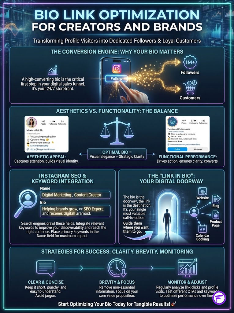
Bio Link Optimization for Creators and Brands
An aesthetic Instagram bio must also be a high-converting bio. If it looks good but doesn’t get clicks, it is failing its primary business purpose.
Keyword Integration for Internal Search
Instagram has its own SEO engine. If you want to be found for “Graphic Design,” those words must appear in your Name or Bio fields in standard text.
- Hybrid Strategy: Use fancy text for bio for your slogan or hook, but keep your job title and specific niche keywords in standard text.
- Keywords: Bio link optimization, Instagram bio link optimization.
The Link in Bio Ecosystem
Your bio is the doorway; the link is the destination.
- Tools: Linktree, Beacons, and Bento are the standard entities here.
- Aesthetic Matching: Ensure your link-in-bio landing page uses the same Instagram bio fonts and color palette as your profile to create a seamless user journey. A mismatch here causes a high bounce rate.
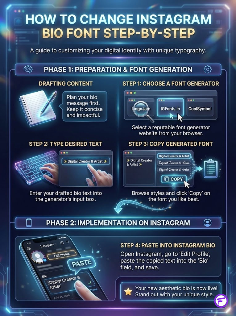
How to Change Instagram Bio Font Step-by-Step
Changing your font is simple, but doing it without breaking your formatting requires a specific process. Follow these steps to ensure a glitch-free profile.
Phase 1: Drafting and Generation
- Write it out: Open your phone’s Notes app. Type out your full bio exactly how you want it to read.
- Identify the aesthetic: Decide which words need to be “fancy” (e.g., just the headline) and which should remain standard for SEO.
- Generate: Go to https://fancyfontgenerators.com. Type your chosen phrase into the input box.
- Select Style: Scroll through the options. Look for “Serif,” “Script,” “Double Struck,” or “Small Caps.”
Phase 2: Implementation and Testing
- Copy and Paste: Select the generated text and copy it.
- Edit Profile: Open Instagram, go to “Edit Profile,” and paste the text into the Bio field.
- The Space Check: Instagram often adds a trailing space after a paste. Delete the last space after your text before hitting save.
- Device Check: View your profile from a friend’s phone or a desktop computer to ensure the unique Instagram bio quotes copy and paste characters display correctly and aren’t turning into boxes.
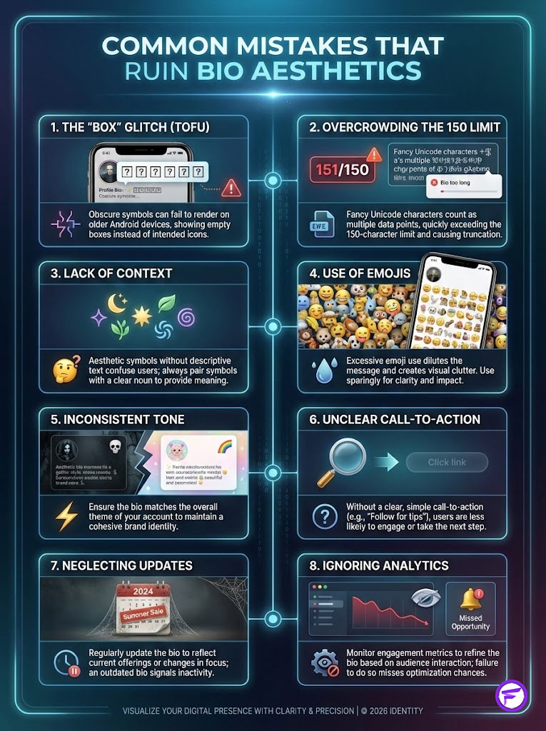
Common Mistakes That Ruin Bio Aesthetics
Even with the best intentions, a bad bio can hurt your growth. Avoid these common pitfalls.
The “Box” Glitch (Tofu)
As mentioned, not all Unicode is supported everywhere. If you pick a very obscure symbol from a deep Unicode block, it will show as a box on older Android phones.
- Fix: Stick to the most popular fonts on the generator, as these are usually from the standard Unicode blocks (Basic Multilingual Plane).
Overcrowding the 150 Limit
Instagram bio fonts often take up more “data” space than regular letters. Some fancy characters count as two or even four characters in the backend code. Even if it looks like you have room visually, Instagram might say “Bio too long.”
- Solution: Use shorter words or standard text if you hit the limit.
- Keywords: Short aesthetic bios, minimalist bio ideas.
Lack of Context
A bio that is purely aesthetic symbols with no text is confusing. Users need to know what the account is about. Always pair cool Instagram bios with at least one descriptive noun (e.g., “Art,” “Life,” “Music,” “Design”).
Summary and Key Takeaways
Your Instagram bio is the front door to your digital life. In 2026, the trend has moved toward deeply personalized, niche aesthetics that signal immediate belonging to a specific tribe—whether that is the moody intellect of Dark Academia or the clean lines of Minimalism.
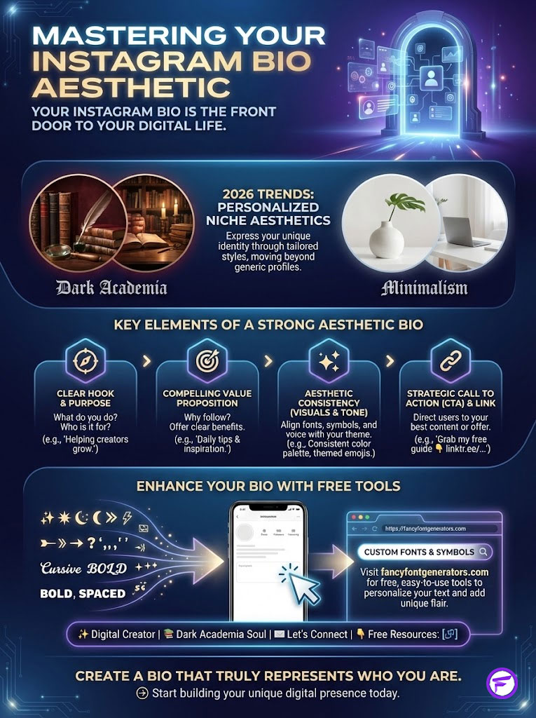
To master the aesthetic Instagram bio, remember the core formula:
- Hook: Use a unique font from a fancy text generator to catch the eye immediately.
- Value: Clearly state who you are in readable text for SEO purposes.
- Structure: Use line breaks and aesthetic symbols for bio to guide the eye downward in a vertical scan.
- Convert: End with a strong CTA pointing to your link using a directional symbol.
Do not let a generic profile hold you back. The tools to upgrade your identity are free and accessible. Visit https://fancyfontgenerators.com today to generate your custom fonts, discover trending symbols, and create a bio that truly represents you.
Frequently Asked Questions (FAQs)
What is the best aesthetic Instagram bio style for 2026?
The most effective style currently is the “Hybrid Minimalist” approach. This combines a clean, sans-serif Instagram bio font for the main tagline with standard text for location and profession. It uses plenty of white space (line breaks) to create a clean, high-end look that is easy to read on mobile devices.
How do I get aesthetic fonts for my Instagram bio?
You can access these styles by using a web-based tool like https://fancyfontgenerators.com. simply type your desired bio text into the input box, and the tool will convert it into various Unicode text styles (like cursive, bold, or typewriter) that you can copy paste bio directly into your Instagram settings.
Why do some fancy fonts show up as question marks or boxes?
This is known as a rendering issue. Instagram bio fonts are actually Unicode symbols. If a specific character code is not supported by the viewer’s device (especially older Android phones) or operating system, it displays a placeholder box (tofu) or a question mark. Stick to widely used styles to minimize this risk.
Can I center my Instagram bio text?
Instagram does not have a “center align” button. However, you can mimic this effect by pasting specific “invisible Braille patterns” or empty Unicode spaces before your text. You have to manually adjust the number of spaces for each line until it looks centered on the mobile screen.
Does using a fancy font hurt my Instagram SEO?
Yes, it can. Instagram’s search algorithm reads standard text (ASCII) best. It often cannot “read” fancy text for bio as keywords. For example, if you write “Pʜᴏᴛᴏɢʀᴀᴘʜᴇʀ” in a fancy font, you might not show up when someone searches for “Photographer.” Always keep your main keywords in standard text.
What are the most trending symbols for bios in 2026?
This year, creators are favoring minimalist celestial and geometric symbols. Top choices include sparkles (✨), stars (⋆ ✦), moons (☾), and clean lines (│ //) for separation. The “heavy” emoji look is out; refined aesthetic symbols for bio are in.
How long can an aesthetic bio be?
Instagram enforces a strict 150-character limit. It is important to note that some unique Instagram bio quotes copy and paste characters count as two bytes (two characters) in the code, meaning your effective limit might be lower when using fancy fonts. Keep your message concise.
How do I make a vertical bio?
To achieve the vertical “list” look, type your bio in your phone’s Notes app first. Hit the “Return” or “Enter” key after each line to create a break. Then, select all the text and copy paste bio into Instagram. The app will recognize the line breaks from your clipboard.
What is a “link in bio” tool?
Since Instagram only allows one clickable link, a “link in bio” tool (like Linktree, Beacons, or a custom page) serves as a mini-website. It houses links to your other socials, products, or blog posts. Optimizing this link with the same Instagram profile aesthetic as your bio is crucial for branding.
Where can I find copy and paste bio templates?
You can find layouts on Pinterest, creative blogs, or specialized generator sites. Once you find a structure you like, use a fancy text generator to customize the specific words while keeping the layout symbols intact.
Is a short or long bio better for aesthetics?
In the current landscape, shorter is better. Short aesthetic bios (often just one or two lines) convey confidence and mystery. They also ensure your “Link in Bio” is visible above the fold without the user having to click “more.”
How often should I change my Instagram bio?
You should refresh your bio whenever your primary focus shifts (e.g., a new product launch, a location change, or a rebrand). However, for aesthetic purposes, changing it seasonally (every 3-4 months) keeps your profile feeling active and aligned with current aesthetic bio ideas.
Disclaimer:
This article is for educational and informational purposes only. While the strategies regarding Instagram bio fonts and SEO are based on current digital marketing standards and platform behaviors as of 2026, social media algorithms are subject to change without notice. The mention of specific tools like fancyfontgenerators.com is a recommendation based on utility and safety for generating Unicode characters.
References:
- Meta Platforms Inc. Help Center – Editing Your Profile
- Unicode Consortium – Technical Standard & Character Database
- Nielsen Norman Group – Reading Patterns on Digital Displays
- Social Media Examiner – Instagram Marketing Industry Reports