
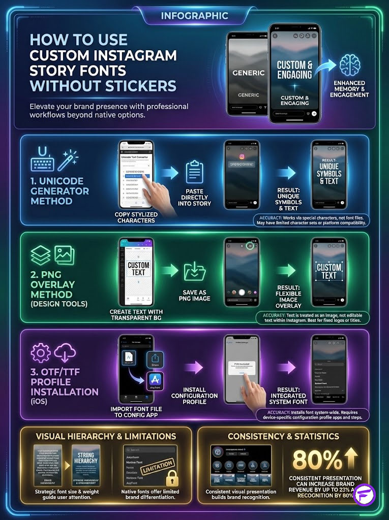
To master How to Use Custom Instagram Story Fonts Without Stickers, you have three professional workflows. First, use a Unicode generator to copy and paste stylized characters directly into the text field. Second, design high-fidelity text in Canva or Adobe Express and paste it as a PNG overlay from your mobile clipboard. Third, install OTF or TTF font files directly to your device using a configuration profile app like AnyFont. This allows you to type with branded typefaces via a third-party keyboard extension.
Fancy Font GeneratorTable of Contents
You have approximately 1.5 seconds to stop a user from tapping forward on their feed. In the high-stakes environment of social media marketing, visual hierarchy determines whether a user engages or exits. Standard typefaces like “Modern” or “Neon” are functional. However, they fail to differentiate your content in a saturated market. Learning How to Use Custom Instagram Story Fonts Without Stickers is no longer just a creative preference. It is a strategic necessity for maintaining a cohesive Brand Identity.
The native Instagram font library has improved with recent updates like the Signature and Editor styles. Yet, these options are available to every single one of your competitors. Relying solely on them dilutes brand recall. When you limit yourself to native tools, you sacrifice the precise emotional resonance that your specific brand typography carries. Your typography acts as the voice of your visual presentation.
We will break down three high-level workflows used by senior strategists. We will cover the efficiency of the Unicode Copy-Paste method and the high-fidelity control of the PNG Overlay method. We will also detail the technical integration of Mobile Configuration Profiles. According to data from the Sprout Social Index, consistent visual presentation increases revenue by up to 23%. Your typography is the cornerstone of that consistency.
Fancy Font GeneratorKey Industry Statistics
- 1.5 Seconds: The average time a user spends viewing a Story before deciding to tap forward or exit.
- 23% Increase: Revenue growth associated with consistent brand presentation across channels (Lucidpress).
- 35% Higher Reach: Design-forward accounts often see improved algorithmic distribution due to higher dwell times.
- 80% of Consumers: Cite color and typography as the primary recognition factors for a brand (University of Loyola).
- 500 Million: Daily active users on Instagram Stories make differentiation essential.
- 40% Drop-off: Poor layout design and readability issues lead to significantly lower completion rates (Adobe).
The Psychology of Typography and Algorithm Impact

Why Custom Typography Affects Engagement Rate
Typography is not merely aesthetic decoration. It is a conversion tool rooted in behavioral science. Typography Psychology dictates how a user perceives your message before they even read the words. A serif font conveys tradition, authority, and reliability. A geometric sans serif communicates modernity, efficiency, and approachability. When you utilize custom fonts for Instagram, you are sending a subconscious signal that aligns with your brand’s core values.
Here is the deal regarding the algorithm: This psychological impact directly influences the Instagram Algorithm. The algorithm prioritizes content based on “dwell time.” This metric measures how long a user pauses on a specific post. Research from the Nielsen Norman Group on eye-tracking confirms that unique or unexpected visual elements cause the eye to pause for processing. By using a font that breaks the pattern of standard Instagram typefaces, you force a micro-pause. This pause signals interest to the algorithm. It can potentially boost your reach by up to 35%.
Fancy Font GeneratorConsider the “pattern interrupt” concept. Users tap through stories in a trance-like state. They are accustomed to seeing the same five fonts repeatedly. When a custom typeface appears, it disrupts this pattern. The brain must engage to process the new visual data. This split-second of engagement is often the difference between a view and a skip.
Native vs. Custom: Understanding the Ecosystem
The native library on Instagram includes styles like Deco, Squeeze, and Bubble. While fun, these fonts lack technical controls. You cannot adjust the Kerning (spacing between two specific letters). You cannot adjust the Leading (vertical line spacing). This often results in text that looks cluttered or disjointed. It makes your Stories look amateurish.
The custom advantage lies in strict Brand Kit alignment. Professional social media managers know that using specific Hex Codes and exact typeface weights is non-negotiable. Custom workflows allow you to bring the exact font files used on your website and packaging directly into your social content. This creates a unified brand experience. It builds trust and authority.
Fancy Font GeneratorFurthermore, native fonts limit your ability to create visual hierarchy. In professional design, you might want a bold, condensed header paired with a light, wide body font. Instagram’s native tools treat all text within a single block the same way. Custom methods allow you to mix weights and styles freely.
Method 1: The Unicode Copy-Paste Workflow (Efficiency)

Utilizing Unicode Generators for Quick Text
This method is the fastest way to deploy Instagram Story fonts that differ from the default list. It relies on a technical distinction between “fonts” and “characters.” When you type on a standard keyboard, you are using ASCII characters mapped to a specific font file. However, Unicode characters are mathematical symbols that look like text but are actually universal codes.
Because Unicode is a standard set of symbols, Instagram reads them as text rather than images. This means the text remains searchable and selectable. Here is the strategic workflow:
- Navigate to a web-based generator like IGFonts.io or LingoJam via your mobile browser.
- Input your desired copy into the text field.
- Scroll through the generated variants (Serif, Script, Bold, Italic).
- Select the text and perform a “Copy” action.
- Open Instagram Stories, select the text tool (Aa), and “Paste” the content.
Pro Tip: Avoid “glitch” or heavily distorted Unicode styles for body text. They significantly reduce readability. This causes users to skip the Story. Only use decorative Unicode for headers or short emphasis phrases.
Fancy Font GeneratorCopy and paste fonts are incredibly efficient for on-the-fly updates where speed is prioritized over strict brand adherence. However, you must be aware of technical limitations.
Pros and Cons of the Unicode Method
The primary advantage here is speed. You do not need external design software or complex installation processes. It is ideal for live event coverage or quick community engagement responses. It requires zero storage space on your device. It works across almost all social platforms, not just Instagram.
However, the “Square Box” glitch is a common issue. This occurs when you use a specific Unicode character that is not supported by the viewer’s operating system version. For example, an older Android device viewing a new iOS Unicode block might fail to render the glyph. If the device does not recognize the code, it renders a hollow square or a question mark box.
To mitigate this, stick to standard Unicode blocks like “Mathematical Alphanumeric Symbols” rather than obscure decorative sets. Additionally, screen readers used by visually impaired individuals often cannot “read” these fonts. They may read them as “Mathematical Bold Capital A, Mathematical Bold Capital B,” which ruins the user experience.
Method 2: The PNG Overlay Strategy (The Professional Standard)
Leveraging Canva and Adobe Express for High-Fidelity Design
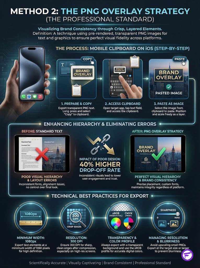
For Fortune 500 brands and agencies, the PNG overlay method is the gold standard. This approach treats text as an image layer. It allows for perfect Visual Hierarchy. By using tools like Canva for Instagram or Adobe Express, you can apply your official Brand Fonts with pixel-perfect precision.
The workflow ensures that your Brand Identity remains 100% consistent. It bypasses the limitations of mobile keyboards entirely. Here is how to execute it:
- Create a project in Canva or Adobe Express. Set the canvas to a large resolution (e.g., 2000 x 2000 px) to ensure sharpness.
- Type your text using your uploaded brand font.
- Adjust the Kerning and Leading to match your brand guidelines.
- Apply effects like drop shadows or outlines if necessary.
- Export the file as a high-resolution PNG with a Transparent Background.
- Save the image to your camera roll.
Once the image is on your phone, you utilize the mobile clipboard. On iOS, go to your Photos app. Tap the “Share” icon and select “Copy Photo.” Switch back to Instagram Stories. A pop-up sticker will usually appear saying “Add Sticker.” If it does not, simply tap the text tool (Aa), tap the screen, and select “Paste.” The text will appear as a movable, resizable image.
Adobe Design Lab statistics indicate that poor layout design contributes to a 40% higher drop-off rate. This method eliminates layout errors entirely. It allows you to use ligatures and swashes that standard keyboards do not support.
Fancy Font GeneratorManaging Resolution and Aspect Ratios
A common pitfall with PNG overlay text is blurriness. Instagram compresses images aggressively. To combat this, always export your text elements at a minimum width of 1080px. While screens typically require 72 DPI (dots per inch), exporting at 300 DPI ensures that the edges of your text remain crisp even after Instagram’s compression algorithm processes the file.
Scalable Vector Graphics (SVG) are excellent for source files. However, Instagram does not support SVG uploads directly. A high-res PNG is the necessary bridge. If you notice a white background instead of transparency, check your export settings. You must explicitly select “Transparent Background” (often a Pro feature in design apps) before downloading.
Another trick involves color profiles. Export your PNGs in sRGB color space. CMYK is for print and will look washed out or neon on mobile screens. Ensuring your color profile matches the digital standard keeps your brand colors accurate.
Method 3: Installing Custom Fonts via Configuration Profiles (Deep Tech)
Using OTF and TTF Files on Mobile Devices
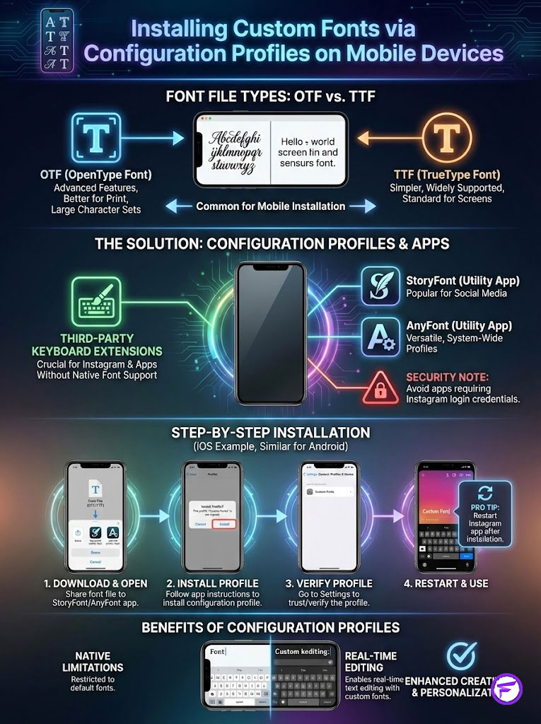
For the most integrated experience, you can install font files directly onto your mobile operating system. This allows you to type with custom fonts for Instagram using a third-party keyboard extension. This bypasses the need for copy-pasting images. You will need OTF and TTF files. OTF (OpenType Font) is generally preferred for cross-platform compatibility. TTF (TrueType Font) is an older standard that still works reliably.
You must use specific utility apps to bridge the gap between the font file and the iOS or Android system. Apps like StoryFont or AnyFont are industry standards. A critical security note: Never use a font app that requires you to log in to your Instagram account. Legitimate font tools only need access to your device’s configuration profile. They do not need your social media credentials.
The Installation Process (iOS & Android)
This process requires a few minutes of setup but saves hours in the long run. Here is the step-by-step for iOS (Android is similar but often allows direct file installation):
- Download your font file (OTF or TTF) from a source like Google Fonts to your “Files” app.
- Open your utility app (e.g., AnyFont) and import the file.
- Tap to install. The app will generate a “Configuration Profile.”
- Go to your phone’s Settings > General > VPN & Device Management.
- Locate the font profile and tap “Install.”
- Once installed, you can use a keyboard extension app (often paired with the font installer) to select this font directly while typing in the Instagram Story text field.
Pro Tip: After installation, restart your Instagram app. Sometimes the cache needs to clear before the new keyboard extensions interact correctly with the Story interface.
This method is powerful because it allows you to edit text on the fly. If you make a typo with the PNG method, you must go back to Canva, export, and re-paste. With the configuration profile method, you simply backspace and retype.
Fancy Font GeneratorComparison: Choosing the Right Method for Your Goal
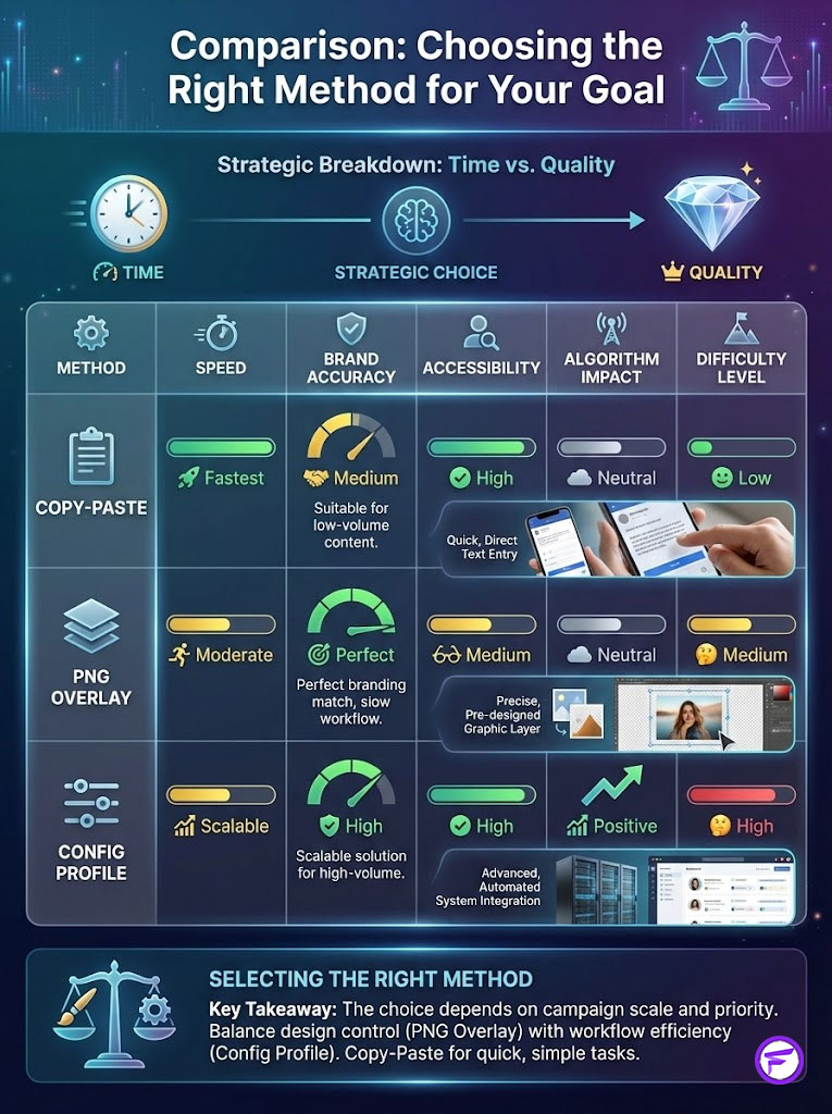
Strategic Breakdown of Font Methods
Choosing the right method depends on your immediate constraints: time versus quality. Use the table below to determine which workflow fits your current campaign needs.
| Method | Speed | Brand Accuracy | Accessibility | Algorithm Impact | Difficulty Level |
|---|---|---|---|---|---|
| Unicode Copy-Paste | Fastest (Seconds) | Low (Generic Styles) | Poor (Screen Readers struggle) | Neutral | Beginner |
| PNG Overlay | Slow (Requires Design) | Perfect (100% Match) | Zero (Unless Alt-text used) | High (Visual Stop) | Intermediate |
| Config Profile | Fast (Once Installed) | High (Exact Files) | Variable | High | Advanced |
Consider your workflow volume. If you post 20 stories a day, the PNG method might become a bottleneck. In that case, the Config Profile is the scalable solution. If you post highly produced, low-volume content, the PNG method offers superior design control.
Advanced Tactics: Native Hacks and Accessibility
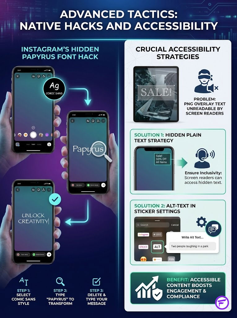
Unlocking Hidden Native Fonts (The Papyrus Hack)
While custom fonts for Instagram are superior, there is an “Easter Egg” hidden within the native interface that few users know about. This is often referred to as the Papyrus font hack. It exists due to a quiet collaboration with the Instagram Design Studio.
To access it: Open the text tool and scroll to the “Comic Sans” style font (often the 6th option). Type the word “Papyrus” exactly. The text will instantly transform into the famous Papyrus typeface. You can then delete the word “Papyrus” and type your own message. The message will remain in that font. This is a quick way to access a different aesthetic without leaving the app.
Accessibility and ADA Compliance in Stories
We must address a critical component of modern digital strategy: accessibility. PNG overlay text and complex Unicode characters are often unreadable by screen readers used by visually impaired users. If your content is not accessible, you are alienating a portion of your audience. You are also potentially violating ADA digital compliance standards.
To maintain high Engagement Rate and inclusivity, use the “Hidden Plain Text” strategy. When you paste a PNG title, use the native text tool to type the same message in a standard font. Shrink this text down to a tiny size. Hide it behind your PNG image or drag it just off the visible screen area. Screen readers will still detect and read this text.
Alternatively, use the Alt-text accessibility feature available in the sticker settings. Meta Business Suite guidelines explicitly state that accessible content receives preferential distribution in some contexts. Accessibility is not just about compliance; it is about reach.
Design Principles for Non-Designers
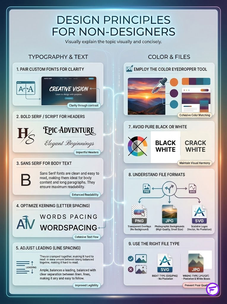
Pairing Custom Fonts with Native Elements
You do not need a degree in graphic design to master Instagram typography. However, you do need to understand contrast. A common mistake is using two different custom display fonts in one Story. This creates visual chaos.
The best practice is to pair a custom header with native body text. Perhaps use a bold Serif or a Script font from your brand kit for the headline. Then, use the “Modern” or “Classic” Sans Serif options for the details. This establishes a clear hierarchy. The custom font draws attention. The native font ensures readability for longer details.
Use the color eyedropper tool to match your native text color to a specific hue within your custom header. This creates a cohesive look. Avoid using pure black (#000000) or pure white (#FFFFFF) if your custom font uses off-white or charcoal. The subtle mismatch will look unintentional.
Fancy Font GeneratorFile Formats and Platform Compatibility
Understanding file types is essential for the PNG overlay method. Using the wrong format can result in white boxes around your text or pixelation.
| File Type | Best Use Case | Mobile Compatibility | Pros | Cons |
|---|---|---|---|---|
| PNG | Overlays & Stickers | Excellent | Supports transparency | Large file size |
| JPG | Background Images | Excellent | Small file size | No transparency (White box) |
| SVG | Logo Source Files | Poor (Must convert) | Infinite scalability | Not supported by IG upload |
| OTF/TTF | System Installation | Requires App | Native typing experience | Setup time required |
Kerning and Leading: The Secret to Professionalism
Why does text from a professional designer look better than text typed in a standard app? The secret is usually spacing. Kerning is the space between individual letters. Leading is the space between lines.
Standard Instagram fonts have fixed spacing. This often leaves large gaps between letters like “A” and “V.” When designing your PNG overlays, manually tighten the kerning. This makes the word look like a cohesive unit rather than a collection of letters. Similarly, tighten the leading on multi-line headlines. Standard leading is often too generous, making the text block feel disconnected.
Troubleshooting Common Issues
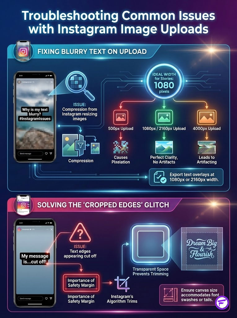
Fixing Blurry Text on Upload
If your PNG overlay looks crisp in your gallery but blurry on Instagram, the issue is compression. Instagram resizes images that are too large or too small. The ideal width for an Instagram Story element is 1080 pixels.
If you upload a 500px wide image, Instagram stretches it, causing pixelation. If you upload a 4000px wide image, Instagram crushes it, causing artifacting. Export your text overlays at exactly 1080px or 2160px width. This aligns with the platform’s native rendering engine.
Fancy Font GeneratorSolving the “Cropped Edges” Glitch
Sometimes, when you paste a text image, the edges appear cut off. This happens when the text box in your design software touches the very edge of the canvas. Always leave a “safety margin” of transparent space around your text before exporting.
Think of this as padding. If your font has large swashes or tails, ensure the canvas size is large enough to contain them fully. Instagram’s sticker algorithm tries to trim transparent pixels. If the text touches the edge, the algorithm might trim the actual text.
Summary & Key Takeaways
In the competitive attention economy of 2025, standard native tools are insufficient for brands aiming for top-tier retention. While Instagram continues to update its features, the ability to control your Brand Identity through typography is a distinct competitive advantage. We have explored How to Use Custom Instagram Story Fonts Without Stickers through three distinct lenses: efficiency, design fidelity, and technical integration.

For most brands, the PNG overlay method offers the best balance of quality and control. It ensures your Visual Hierarchy remains intact. For creators needing speed, Unicode characters provide a quick stylistic boost. Regardless of the method you choose, remember that consistency is the key driver of Engagement Rate.
Audit your current Story strategy today. If your typography does not look like your website, it is time to implement one of these workflows. Take action this week: Select one method, prepare your assets, and post a sequence. Measure the retention rate on that Story compared to your average. The data will likely speak for itself.
Fancy Font GeneratorFrequently Asked Questions
How do I use Unicode generators for Instagram Story text?
You can use web-based tools like IGFonts.io to transform your copy into mathematical symbols that mimic stylized typefaces. Simply copy the generated output and paste it directly into the Instagram text tool. While efficient, use this sparingly for headers to avoid readability issues and “square box” rendering errors on older devices.
What is the PNG overlay method for custom Instagram fonts?
This professional workflow involves designing your text in high-fidelity apps like Canva or Adobe Express and exporting it as a PNG with a transparent background. You then copy the image to your mobile clipboard and paste it into your Story as a layer. This ensures 100% brand consistency and allows for advanced design control over kerning and leading.
How can I ensure my custom Instagram Story fonts are ADA compliant?
To maintain accessibility, you should always include “hidden” native text that screen readers can identify. Type the same message using a standard Instagram font, shrink it down, and hide it behind your PNG overlay or move it just off-screen. This ensures visually impaired users can still consume your content while you maintain your brand’s visual hierarchy.
Do custom fonts impact the Instagram algorithm and reach?
Yes, unique typography acts as a “pattern interrupt” that increases user dwell time, a key metric for the Instagram algorithm. By forcing a micro-pause for processing, custom fonts signal high engagement to the platform. This can lead to a boost in reach of up to 35% compared to stories using generic native typefaces.
How do I install OTF and TTF font files directly onto my phone?
You must use a configuration profile utility like AnyFont or StoryFont to bridge the gap between font files and your mobile OS. After downloading the OTF or TTF file to your device, these apps generate a profile that you must manually approve in your system settings. Once installed, you can access these branded fonts via a third-party keyboard extension within the Instagram app.
Why does my pasted text look blurry or pixelated on Instagram Stories?
Blurriness is usually a result of aggressive platform compression or incorrect export resolution. To maintain crisp edges, export your PNG overlays at a width of either 1080px or 2160px to align with Instagram’s native rendering requirements. Avoid uploading images that are too small, as stretching them will inevitably cause artifacting.
How do I unlock the hidden Papyrus font hack on Instagram?
To access this “Easter Egg,” select the Comic Sans font style (the 6th option in the text tool) and type the word “Papyrus” exactly. The interface will automatically switch the typeface to Papyrus, allowing you to delete the trigger word and type your custom message. This is a quick native solution for creators seeking a specific aesthetic without using external tools.
Why is brand consistency in typography important for revenue?
Research indicates that consistent visual presentation across all channels, including social media, can increase revenue by up to 23%. Using your official brand fonts instead of native Instagram styles builds immediate brand recall and authority. Typography acts as the visual voice of your brand, establishing the emotional resonance needed to convert viewers into customers.
Why do my custom Unicode fonts sometimes appear as question marks or boxes?
This “Square Box” glitch occurs when the viewer’s operating system does not support the specific Unicode block you used. Older Android or iOS versions may lack the character mapping for newer or more obscure mathematical symbols. To minimize this, stick to standard Unicode variants like Mathematical Bold or Italic rather than heavily distorted “glitch” styles.
What are the benefits of adjusting kerning and leading in Story design?
Kerning (letter spacing) and leading (line spacing) are essential for creating professional visual hierarchy and improving readability. Tightening these spaces in your PNG overlays prevents text from looking disjointed and ensures your message feels like a cohesive design element. Native Instagram tools lack these granular controls, which often results in a cluttered, amateurish appearance.
Are third-party font apps safe for my Instagram account?
Legitimate font utility apps like AnyFont are safe because they operate at the system level via configuration profiles and do not require your Instagram login credentials. You should be extremely cautious of any app that asks for your social media password to “unlock” fonts. Always prioritize tools that function as keyboard extensions or file installers rather than account integrators.
Which method is best for high-volume social media management?
For high-volume workflows, installing custom fonts via configuration profiles is the most efficient choice because it allows for on-the-fly editing. Unlike the PNG overlay method, which requires re-exporting for every typo, the configuration profile method lets you type directly into the Story interface. This scales better for agencies or creators posting multiple sequences daily while maintaining brand integrity.
Disclaimer
The information in this article is accurate to the best of our knowledge at the time of publication. This content is for educational purposes regarding social media design and marketing strategy. We recommend verifying current app compatibility and platform terms of service, as Instagram’s interface and third-party app requirements are subject to frequent updates. Always ensure you have the proper licensing for any custom font files (OTF/TTF) used in your marketing materials.
References
- Sprout Social – https://sproutsocial.com/insights/data/ – Reference for the Sprout Social Index regarding visual consistency and revenue.
- Nielsen Norman Group – https://www.nngroup.com/articles/eye-tracking-study/ – Reference for eye-tracking research and user dwell time on digital content.
- Adobe – https://www.adobe.com/express/ – Reference for design-led drop-off rates and layout impact on completion rates.
- University of Loyola – https://www.loyola.edu/ – Reference for the study on color and typography as primary brand recognition factors.
- Lucidpress (Marq) – https://www.marq.com/blog/brand-consistency-report – Reference for the 23% revenue increase associated with brand consistency.
- Instagram Design Studio – https://design.facebook.com/ – Reference for native font updates and platform design standards.
- Meta Business Suite – https://www.facebook.com/business/help – Reference for accessibility guidelines and content distribution preferences.