
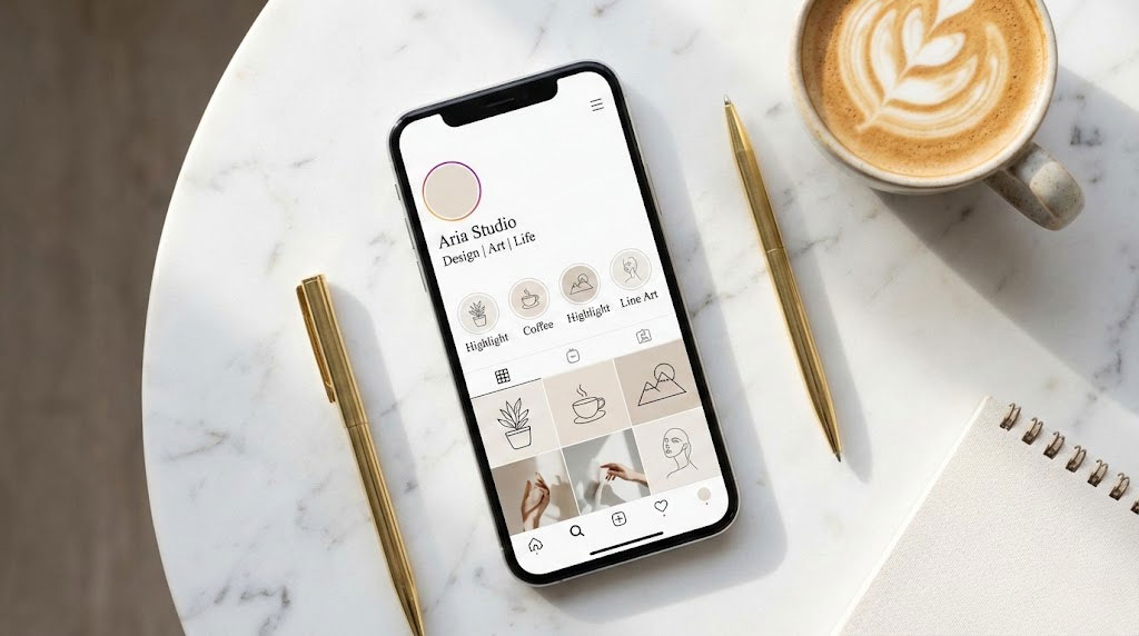
The key to matching Instagram highlight fonts with icons lies in visual weight and geometric consistency. If your icon uses thin, elegant lines, pair it with a lightweight Serif or Sans-Serif Unicode style. For solid, bold icons, choose a heavy, blocky font. Always adhere to the “2:1 Rule,” ensuring the icon is visually twice the size of the text to maintain hierarchy. Avoid script fonts for essential navigation to ensure accessibility.
Table of Contents
You have roughly three seconds to convince a new visitor to stay on your profile. That is the reality of the attention economy. While your bio tells them who you are, your Highlights section acts as the navigation bar for your brand’s mobile website.
Fancy Font GeneratorIt is the “above the fold” prime real estate. It directs traffic to your services, reviews, and portfolio. Yet, I see the same mistake happen repeatedly during brand audits.
A business owner invests heavily in a logo and photography. But they leave their Highlight section in a state of aesthetic chaos. They choose a trendy “handwritten” font they found on a generator site.
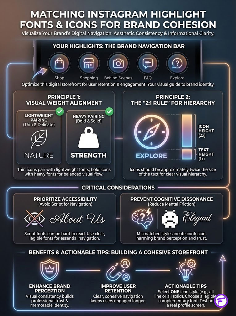
They pair it with a heavy block icon and call it a day. The result? Cognitive dissonance. When your Best Instagram highlight fonts do not match your visual anchors, the user interface feels broken.
It signals a lack of attention to detail. This guide is not just about making things look pretty. It is a technical deep dive into visual hierarchy, typography pairing, and the psychology of user retention.
We are going to fix your digital storefront. We will ensure every pixel works to convert visitors into followers.
Key Statistics: The Impact of Profile Optimization
- Retention: Consistent visual branding across platforms can increase revenue by up to 23% (Lucidpress).
- First Impressions: It takes about 0.05 seconds for users to form an opinion about your website or profile (Taylor & Francis).
- Engagement: Profiles with curated Instagram highlight covers see a higher click-through rate on stories than those without.
- Accessibility: Over 2.2 billion people live with vision impairment; inaccessible fonts alienate a massive market segment (WHO).
- Conversion: Clear navigation labels reduce bounce rates by clarifying the user journey immediately.
The Psychology of Visual Consistency (Why Matching Matters)
Before we touch the tools, we need to understand the brain. Humans crave patterns. When we scan a digital interface, our brains actively look for symmetry.

We look for logical groupings to reduce the energy required to process information. This is known as Cognitive Load Theory. The easier it is to process your profile, the longer people stay.
The Science of First Impressions and Cognitive Load
When you use Instagram highlight covers that feature delicate, minimalist line art, your audience creates an expectation. They expect the supporting text to follow the same physical rules.
If you pair that delicate icon with a heavy, bold Gothic font, you create visual friction. The eye struggles to connect the two elements as a single unit. It feels like a mistake.
According to research by the Nielsen Norman Group regarding user consistency, maintaining internal consistency increases user trust. On Instagram, your Highlights are functional buttons.
If the “button” (the icon) and the “label” (the font) clash, the user hesitates. Hesitation kills conversion. The goal is to make the journey from the icon to the text invisible.
The eye should travel from the visual anchor to the descriptor without registering a change in “weight” or “mood.” It should feel seamless.
The “Halo Effect” in Branding
There is a concept in psychology called the Halo Effect. It suggests that if a user has a positive experience with one aspect of your brand, they generalize it. They assume the rest of your brand is equally high-quality.
A polished, cohesive Highlight section acts as a trust signal. It tells the viewer that this brand cares about the details. It implies your products or services are handled with the same care.
Fancy Font GeneratorAudit your current profile right now. Look at your “Reviews” highlight. Does the font style match the “About” highlight?
Do the icons share the same line thickness? If your “Services” highlight looks like it belongs to a corporate law firm, but your “BTS” highlight looks like a chaotic scrapbook, you have a problem.
You are breaking the Halo Effect. You need a unified visual language to build authority.
Technical Foundation: Understanding Instagram Fonts
Here is where many social media managers get confused. You are not actually changing the font on Instagram. The platform uses a standard system font.

This is usually San Francisco on iOS and Roboto on Android. Instagram does not allow you to upload `.ttf` or `.otf` files for your Highlight titles. You are bypassing the system.
The Unicode Reality: It’s Not a Font, It’s a Symbol
When you use a tool like LingoJam or IGFonts to generate “fonts,” you are technically mapping your text. You are converting standard letters into Unicode text symbols.
These are mathematical alphanumeric symbols. They were designed for scientists and mathematicians to denote variables in equations. We have co-opted them for aesthetic purposes.
Why does this matter? Because they are not optimized for readability in the same way standard typography is. Some Unicode sets lack proper kerning.
Kerning is the spacing between letters. Without it, letters crash into each other. Others do not have bold or italic variants.
Understanding that you are working with symbols helps explain technical glitches. It explains why some characters turn into empty boxes on older devices. These boxes are often called “tofu.”
If the device’s operating system does not have that specific Unicode block installed, the text fails. Your beautiful title becomes a row of rectangles.
The Accessibility Trap (Critical for Modern Brands)
This is the most significant risk when choosing the Best Instagram highlight fonts. Screen readers are used by the visually impaired. They read Unicode literally.
If you use a fancy script generator for your “Contact” highlight, a screen reader might not say “Contact.” It will read the mathematical description of the symbols.
It might announce: “Mathematical Script Capital C, Mathematical Script Small o, Mathematical Script Small n…” This continues for every letter.
This is a nightmare for user experience. It forces the user to listen to a string of nonsense before they understand the button’s purpose.
While we want our profiles to be beautiful, we must balance aesthetics with functionality. We will discuss the “Safe List” of Unicode characters later in this guide.
Always remember: clarity beats decoration. If your audience cannot read it, they cannot buy it.
The Art of Pairing: Matching Typography to Iconography
To match icons perfectly, you need to think like a typographer. You are looking for shared DNA between the icon and the text.
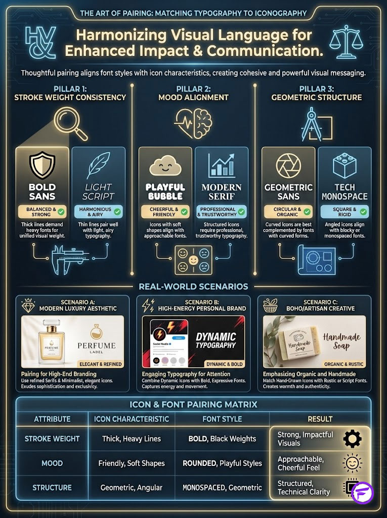
We evaluate this using three pillars. These are Stroke Weight, Mood Alignment, and Geometric Structure. Mastering these three elements ensures a professional look.
Pillar 1: Stroke Weight Consistency
This is the most common failure point. Stroke weight refers to the thickness of the lines that make up your icon. It dictates the visual heaviness of the design.
If your icon is drawn with a fine 1px line, your font should be light or thin. This creates a balanced visual equation. The text feels like an extension of the drawing.
Conversely, if your icon is a solid filled shape, it has high visual mass. You need a font that can stand up to that weight. A bold or heavy font is required here.
If you pair a heavy icon with a thin font, the text disappears. If you pair a light icon with a bold font, the icon looks weak. Balance is key.
Pillar 2: Mood Alignment
Fonts have personalities. A Serif font (with little feet) feels traditional. It signals reliability, history, and editorial quality.
A rounded Sans-Serif feels friendly. It signals tech-forward thinking, modernism, and approachability. Your icon must share this sentiment to avoid confusion.
You cannot pair a playful, cartoonish icon with a severe, old-English Gothic font. The mood clash confuses the user. They don’t know if you are serious or playful.
Pillar 3: Geometric Structure
Look at the corners of your design. Are the edges of your icon sharp and pointed? Or are they soft and rounded?
If your icons rely on circles and curves, choose a font with round O’s. Look for soft terminals (the ends of the letters). This creates geometric harmony.
Fancy Font GeneratorIf your icons are squares and triangles, choose a font with sharp edges. The geometry of the text should mirror the geometry of the image.
Strategic Pairing Scenarios (The Playbook)
Let’s look at specific typography pairing scenarios you can apply immediately. These are proven combinations used by top brands.
Scenario A: The “Modern Luxury” Aesthetic
This is popular among high-end realtors, interior designers, and boutique hotels. The goal is to look expensive. It should feel editorial and curated.
- Icon Style: Fine-line, minimal, single-stroke vectors. Often black on white or beige.
- Font Match: Serif Unicode (resembling Times New Roman or Baskerville) or a spaced-out “Small Caps” style.
- Why it works: The delicate serifs mimic the fine lines of the icon. It feels like reading a fashion magazine header.
Scenario B: The “High-Energy” Personal Brand
This style is common for fitness coaches, motivational speakers, and marketing experts. The goal is to stop the scroll. It demands immediate attention.
- Icon Style: Solid fill, bold colors, blocky shapes. No fine details.
- Font Match: Bold Sans-serif (Gothic or Impact style), strictly All Caps.
- Why it works: The heavy visual weight of the text stands up to the solid block of the icon. Neither element overpowers the other.
Scenario C: The “Boho/Artisan” Creative
This is ideal for photographers, ceramicists, and lifestyle bloggers. The goal is to feel organic. It should feel human and handmade.
- Icon Style: Hand-drawn illustrations, watercolor textures, or organic shapes.
- Font Match: Monospace (typewriter style) or a light Cursive Script (use sparingly).
- Why it works: The typewriter style suggests a “manual” creation process. It reinforces the handmade nature of the brand.
Comparison Table: Icon & Font Pairing Matrix
Use this matrix to identify where your current branding falls. Determine which Unicode text symbols you should be using for maximum impact.
| Icon Style Category | Recommended Font Style (Unicode) | Visual Weight | Brand Vibe |
|---|---|---|---|
| Minimalist Line Art | Serif (Italic or Regular) | Light / Delicate | Luxury, Editorial, Calm |
| Solid Geometric Fill | Bold Sans-Serif (All Caps) | Heavy / Impactful | Tech, Fitness, Corporate |
| Hand-Drawn / Organic | Monospace or Typewriter | Medium / Textured | Artisan, Blogger, Retro |
| 3D / Gradient Icons | Sans-Serif (Normal) | Balanced | SaaS, Modern App, Startup |
| Photographic Covers | Small Caps or Spaced Text | Light / Open | Lifestyle, Travel, Food |
Designing for the Interface: Sizing and Spacing
Even if you choose the perfect pair, poor spacing can ruin the aesthetic instagram profile you are building. Mobile interfaces are unforgiving. You have limited pixels to work with.
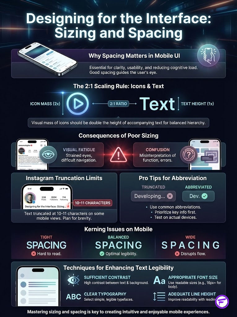
The 2:1 Scaling Rule
In UI design, we often talk about the “Golden Ratio.” But for Instagram Highlights, I prefer the “2:1 Scaling Rule.” It is simple and effective.
The visual mass of your icon (the image in the circle) should be roughly twice the height of your text. This establishes a clear focal point. The eye lands on the image first.
If your text is too large or your icon is too small, the elements compete for attention. The user does not know where to look first. This causes visual fatigue.
Additionally, you must respect the truncation limits. Instagram will cut off your text with ellipses (…) if it exceeds roughly 10 to 11 characters. This varies depending on the width of the characters used.
Pro Tip: Abbreviations are your friend. Instead of “Testimonials,” use “Love” or “Reviews.” Instead of “Questions,” use “FAQ.” This prevents truncation and keeps the design clean.
Fancy Font GeneratorKerning and Spacing on Mobile
Standard Unicode characters often suffer from poor kerning. This is the space between individual letters. Some script styles jam letters together.
This makes them illegible on small retina displays. Conversely, some “Full Width” Unicode styles add massive gaps between letters. This breaks the word apart.
To fix this, you may need to be creative. If a font feels too tight, manually insert a space between each letter (e.g., “S T Y L E”). This is a common technique in editorial design.
It adds elegance and breathability to the text. However, be aware that this doubles your character count. You must keep the words short for this to work.
Step-by-Step Guide: How to Implement Custom Highlight Fonts
Now that we have the theory, let’s execute the strategy. This is the exact workflow I use for client profiles to ensure quality.
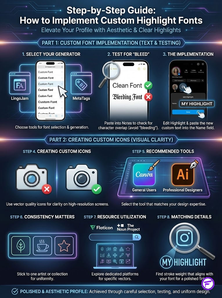
From Generator to Profile (The Workflow)
Step 1: Select Your Generator. There are several reliable tools. LingoJam is excellent for a wide variety of styles.
MetaTags is another great option. It offers a preview of how the font looks on a mock profile. This is incredibly useful for checking visual hierarchy before committing.
Step 2: Test for “Bleed.” Do not paste directly into Instagram yet. Paste your desired text into the Notes app on your phone first.
Check if any characters overlap or look strange. Some Unicode characters have weird vertical spacing. This is your quality control phase.
Step 3: The Implementation. Go to your Instagram profile. Tap and hold the Highlight you want to change. Select “Edit Highlight” from the menu.
You will see options to “Edit Cover” and change the “Name.” Paste your new text into the Name field. Hit “Done” to save your changes.
Creating Custom Icons (Tools of the Trade)
For the icons themselves, you need vector quality. If you use pixelated JPEGs, they will look blurry on high-resolution screens. Quality matters here.
Canva is the standard for most users. It has a massive library of elements. When searching, filter by “Graphics” to find vectors.
Stick to one artist or collection. This ensures the line weights are consistent across all your icons. Inconsistency here ruins the effect.
For professional designers, Adobe Illustrator is the gold standard. It allows you to create custom SVGs. You can perfectly match your brand’s primary typeface.
Resources like Flaticon or The Noun Project are goldmines for specific vectors. If you need a “kettlebell” icon, you will find hundreds of variations.
You can find the specific stroke weight that matches your font. This level of detail sets you apart from the competition.
Niche-Specific Strategies (Case Study Examples)
Different industries require different psychological triggers. What works for a beauty brand will fail for a financial consultant. Context is everything.
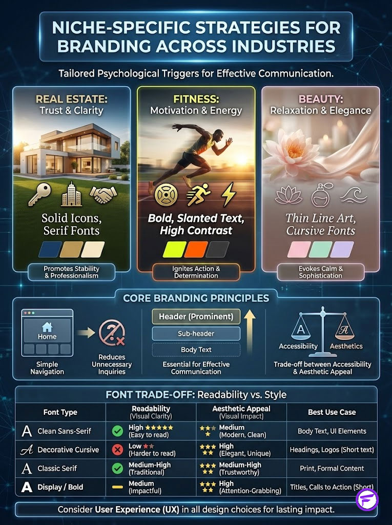
Tailoring the Look to Your Industry
Real Estate Agents
Strategy: Trust and Clarity. You are selling high-ticket items. Your profile needs to look organized and professional.
Use solid icons (House, Key, Contract) paired with a Serif Unicode font. This combination signals stability. It says you are established.
Anecdotal evidence from realtor audits suggests that clear, simple navigation reduces unnecessary DMs. Users can find the info themselves. Use labels like “Sold,” “Tips,” and “Listings.”
Fitness Coaches
Strategy: Motivation and Action. Your brand is about movement. Use bold, slanted text (Pseudo-Italic) to imply speed.
High-contrast icons work best here. Think Black on Yellow or White on Red. Avoid delicate scripts completely.
They look weak in this context. You want to project strength and power. Your highlights should look like buttons on a gym machine.
Fancy Font GeneratorBeauty & Wellness
Strategy: Relaxation and Flow. You want the user to feel calm. Thin line art is the industry standard for a reason.
Pair this with Cursive or Italic Serifs. The “flow” of the font mimics the organic nature of beauty products. It feels liquid and soft.
Avoid hard edges and blocky fonts. They feel too aggressive for a spa or skincare brand. Keep it airy.
Comparison Table: Accessibility vs. Aesthetic Trade-off
We must address the trade-off. Here is how different fonts score on readability versus style. Use this to make informed decisions.
| Font Style Type | Aesthetic Appeal | Readability Score | Screen Reader Safe? | Best For… |
|---|---|---|---|---|
| Standard Instagram Sans | Neutral | 10/10 | Yes (Native) | Critical Info, CTAs, URLs |
| Unicode Serif (Bold) | High (Premium) | 8/10 | No (Reads Symbols) | Brand Names, Short Titles |
| Unicode Script/Cursive | High (Artistic) | 4/10 | No (Inaccessible) | Decorative elements only |
| Unicode Monospace | Medium (Retro) | 9/10 | No (Reads Symbols) | Vlogs, “Behind the Scenes” |
| Small Caps | High (Clean) | 7/10 | No (Reads Symbols) | Minimalist navigation |
Common Mistakes That Kill Profile Conversion
Even with the best intentions, I see brands sabotage their own efforts. They get caught up in the design and forget the user. Avoid these pitfalls to maintain a professional presence.
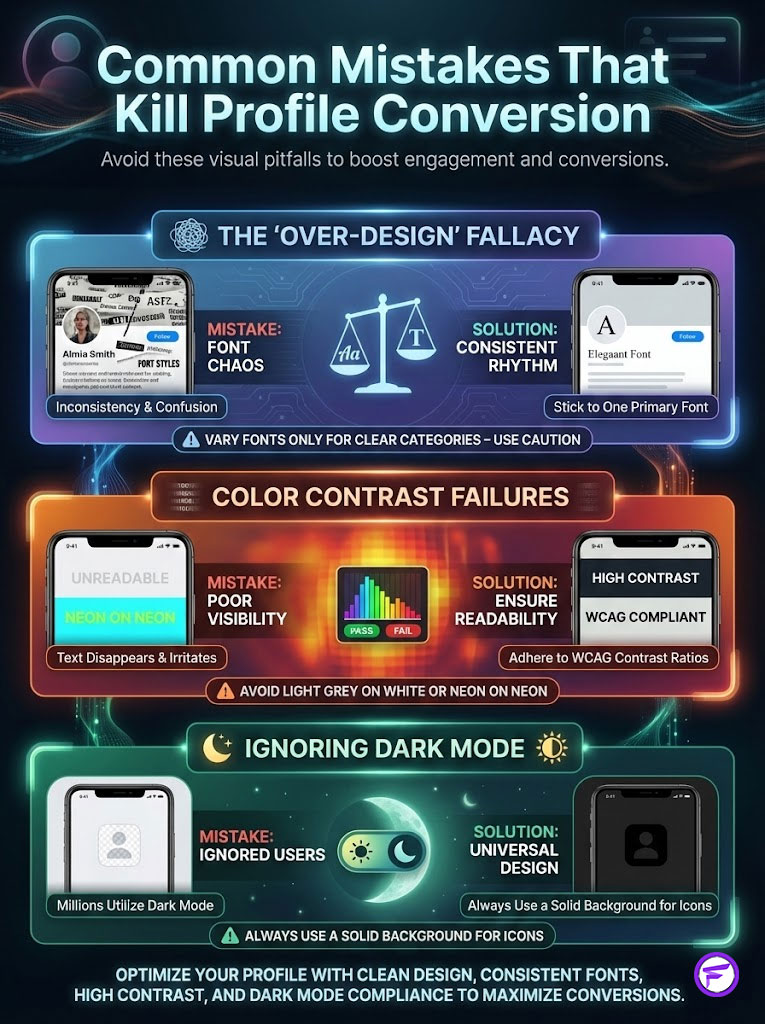
The “Over-Design” Fallacy
There is a temptation to make every highlight unique. You might want a bold font for “Sales” and a script font for “About.” Do not do this.
The “Rule of Consistency” is paramount. Stick to one primary font style for all highlights. It creates a rhythm.
If you must vary it, do so only to distinguish between two clear categories. For example, Services vs. Lifestyle. But even that is risky and can look messy.
Color Contrast Failures
Aesthetics should never compromise visibility. Light grey text on a white background might look “dreamy.” But it is invisible in bright sunlight.
Neon text on a neon background causes eye strain. Adhering to WCAG (Web Content Accessibility Guidelines) contrast ratios is crucial. It is just as important on social media as it is on a website.
Ensure there is sufficient contrast between your icon color and the background circle. If people can’t see it, they won’t click it.
Ignoring Dark Mode
This is a technical detail that separates the pros from the amateurs. Millions of users have their phones set to Dark Mode. The interface colors flip.
If you upload a transparent PNG icon with black lines, and the user is in Dark Mode, the background becomes black. Your black icon disappears completely.
The Fix: Always use a solid background circle for your highlight covers. Use white or a brand color. Do not rely on transparency unless you have tested it in both modes.
Advanced Troubleshooting: When Things Go Wrong
Sometimes, despite your best efforts, the technology fails. Here is how to handle the most common issues. Be prepared for platform quirks.
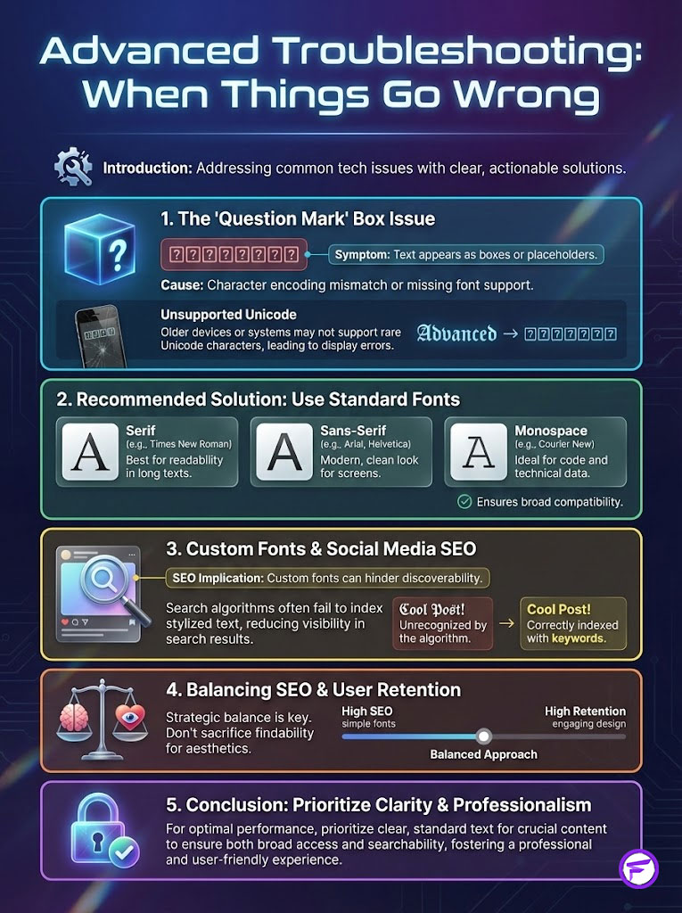
The “Question Mark” Box Issue
Have you ever seen a highlight title that is just a row of boxes with question marks? This is an encoding error. It happens when you use a rare Unicode character.
If the user’s phone is an older model, it won’t have that character in its library. It displays a placeholder instead. This looks unprofessional.
The solution is to stick to the “Safe List.” Use standard Serif, Sans-Serif, or Monospace styles. Avoid the obscure decorative styles if your audience is broad.
The SEO Implication
There is a hidden downside to custom fonts. Instagram’s search algorithm cannot “read” Unicode symbols as text keywords. It sees them as images or math.
If you write “Tips” in a fancy script, you will not rank for the keyword “Tips.” If searchability is your main goal, standard text is safer.
However, user retention often outweighs this specific SEO factor. If the design keeps people on the page, that is a positive signal in itself.
Summary & Key Takeaways
Your Instagram Highlights are not just a storage locker for old stories. They are a curated navigation menu. They guide new users toward a purchase or a follow.
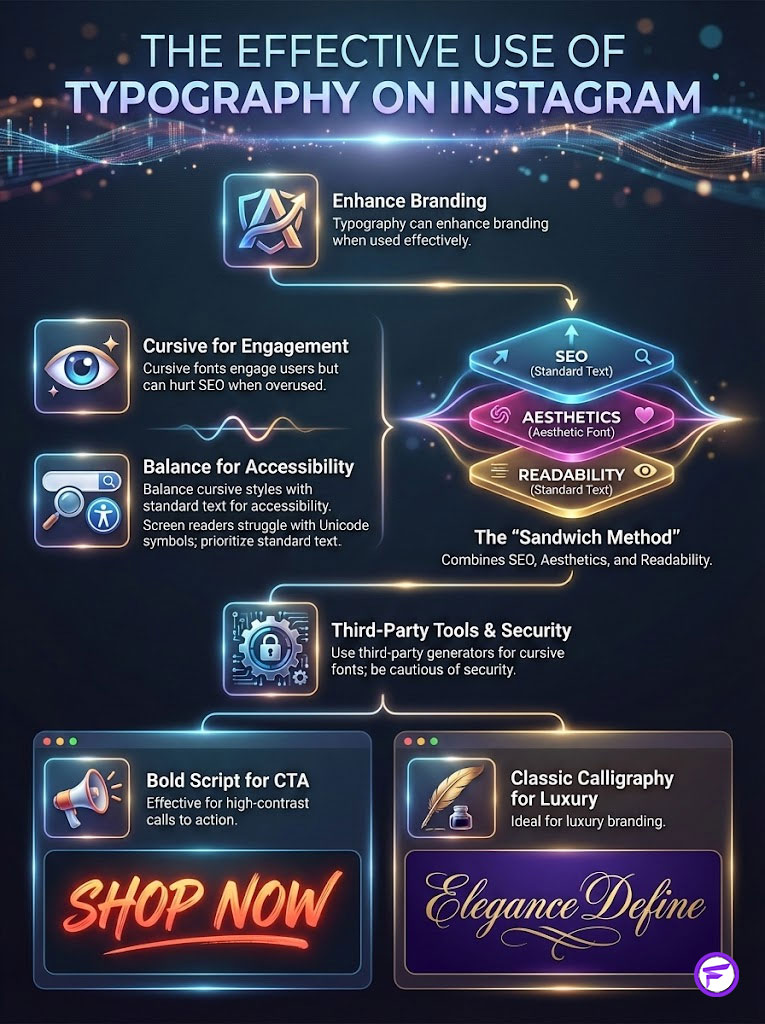
The Best Instagram highlight fonts are the ones that disappear into the design. They allow the user to focus on the content. They do not distract.
Final Verdict: The best font balances brand personality with user readability. If you have to choose between a cool font that is hard to read and a simple font that is clear, choose clarity.
Clarity converts. Confusion kills sales.
Call to Action: I want you to open your Instagram profile right now. Look at your first three highlights. Do the stroke weights match?
Is the text legible without squinting? If not, use the principles of visual weight and stroke matching we discussed. Audit and upgrade your profile today.
Fancy Font GeneratorFrequently Asked Questions
What are the best Instagram highlight fonts for a professional brand?
The best fonts are those that achieve stroke weight consistency with your icons, such as Serif Unicode for elegant luxury brands or Bold Sans-Serif for high-energy profiles. As a brand strategist, I recommend ensuring the visual weight of the text doesn\’t overpower the icon, maintaining a seamless and professional digital storefront.
How do you match Instagram highlight icons with custom fonts perfectly?
To match them perfectly, follow the three pillars of pairing: match the stroke weight (thickness), mood alignment (personality), and geometric structure (rounded vs. sharp edges). Applying the \”2:1 Scaling Rule\”—where the icon is visually twice the size of the text—ensures a professional visual hierarchy that reduces cognitive load.
Why does my Instagram highlight text show up as empty boxes or question marks?
This is known as \”tofu,\” an encoding error that occurs when a user\’s mobile operating system doesn\’t support the specific Unicode block you have selected. To prevent this unprofessional look, stick to the \”Safe List\” of common Unicode styles like standard Serif, Bold Sans, or Monospace and avoid overly decorative or obscure symbols.
How do custom Instagram fonts affect profile accessibility for visually impaired users?
Custom fonts are technically Unicode symbols, which screen readers interpret literally, reading out \”Mathematical Script Capital\” for every single letter. This creates a significant barrier for the billions of people with vision impairments, so you should use decorative fonts sparingly and never for critical navigation labels.
Will using custom fonts in highlight titles hurt my Instagram SEO?
Yes, Instagram\’s search algorithm recognizes standard alphanumeric characters but cannot index Unicode symbols as searchable keywords. If ranking for specific terms like \”Portfolio\” or \”Real Estate Tips\” in search results is your primary goal, it is technically safer to use the platform\’s native system font.
What is the \”2:1 Rule\” in Instagram highlight design?
The 2:1 Rule is a UI design principle stating that the visual mass of your highlight icon should be approximately twice the height of your title text. This establishes a clear focal point, guiding the user\’s eye to the visual anchor (the icon) first before they process the text descriptor.
How can I prevent my Instagram highlight titles from being cut off?
Instagram typically truncates text after 10 to 11 characters, though this varies based on the width of the Unicode characters used. Use smart abbreviations like \”FAQ\” instead of \”Questions\” or \”Reviews\” instead of \”Testimonials\” to ensure your titles remain clean and fully visible on all mobile devices.
What font style should a luxury or high-end brand use for highlights?
High-end brands should pair fine-line, minimal vector icons with Serif Unicode fonts that mimic editorial typography like Baskerville or Times New Roman. This combination leverages the \”Halo Effect,\” signaling premium quality and meticulous attention to detail through sophisticated visual consistency.
Why do my highlight icons look blurry or pixelated on some phones?
Blurriness usually results from using low-resolution JPEGs; for professional results, you should use high-quality vectors from tools like Canva, Flaticon, or The Noun Project. Ensure your icons are exported as high-resolution PNGs with a solid background to remain crisp on modern retina displays.
How do I ensure my highlight covers look good in both Light and Dark Mode?
Avoid using transparent PNGs with dark lines, as they will become invisible when the interface flips to Dark Mode. Always use a solid background circle in a brand-compliant color (like white, beige, or a brand primary) to ensure the icon remains clearly visible regardless of the user\’s system settings.
Can I use handwritten or script fonts for my business highlights?
While script fonts offer an \”Artisan\” or human vibe, they often suffer from poor kerning and low readability on small mobile screens. If you choose a script, use it only for non-essential highlights and ensure the letters don\’t overlap, which increases cognitive load and causes users to bounce.
What tools are best for generating custom Instagram fonts and icons?
For fonts, LingoJam and MetaTags are reliable Unicode generators that offer real-time mobile previews. For icons, Canva is the industry standard for most users, while professional designers should use Adobe Illustrator to perfectly match the stroke weight of their brand\’s primary typeface.
Disclaimer
This article is for informational purposes only. While the design strategies discussed are based on standard UI/UX principles, Instagram’s platform updates may change how Unicode characters are displayed or indexed. We recommend testing all custom fonts on multiple devices to ensure accessibility and readability for your specific audience.
References
Provide 5-8 authoritative reference sources that support the article content:
- Lucidpress (Marq) – 2021 Brand Consistency Report – Findings on how consistent branding across platforms increases revenue by 23%.
- Taylor & Francis Online – “Attention web designers: You have 50 milliseconds to make a good first impression!” – Research study on user opinion formation.
- World Health Organization (WHO) – World Report on Vision – Statistics regarding the 2.2 billion people globally with vision impairment and the importance of digital accessibility.
- Nielsen Norman Group – “Internal and External Consistency” in User Experience – Expert insights on how consistency builds user trust and reduces cognitive load.
- Unicode Consortium – Unicode Standard Documentation – Technical details on how mathematical alphanumeric symbols (Unicode fonts) are encoded and displayed across systems.
- W3C (World Wide Web Consortium) – Web Content Accessibility Guidelines (WCAG) – Standards for color contrast and text readability in digital interfaces.