
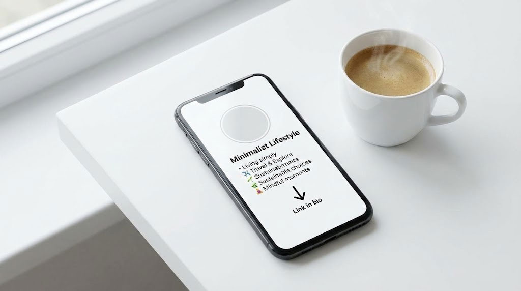
Your digital profile is a storefront window, and you have less than 0.05 seconds to convince a passerby to stop. When mastering how to write about me bio content, the text itself is only half the equation. The rest is visual architecture. As a Digital Identity Architect, I have audited thousands of profiles across Instagram, LinkedIn, and TikTok. The data is clear: profiles that treat their bio as a structured user interface (UI) rather than a simple text block see significantly higher engagement rates.
Fancy Font GeneratorTable of Contents
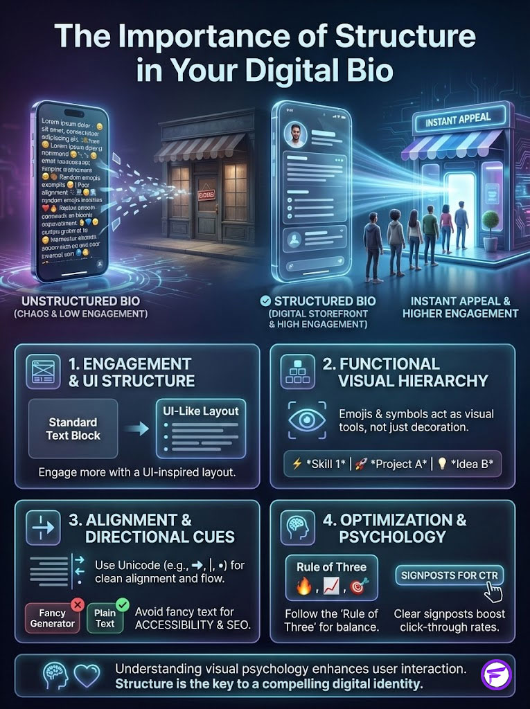
Most users treat emojis and symbols as decoration. This is a mistake. In the economy of attention, these elements are functional tools for visual hierarchy. They act as signposts, dividers, and call-to-action buttons that guide the user’s eye exactly where you want it to go. Whether you’re building a personal brand or a corporate identity, understanding the technical and psychological application of aesthetic bio symbols is the difference between a bounce and a follow.
The Architect’s Blueprint
To optimize a bio with symbols, you must use Unicode characters to create structure, not just “vibes.” Use vertical bars ( | ) or invisible spaces (U+2800) to align text and directional arrows ( ↴ ) to increase click-through rates on your links. However, never use a fancy text generator for your name or primary keywords. Screen readers can’t interpret them, which destroys your accessibility and SEO. Prioritize clarity over clutter by sticking to the “Rule of Three” for emoji placement strategy.
Fancy Font GeneratorKey Statistics: The Science of Symbols
- 0.05 Seconds: Time it takes for a user to form an opinion about your profile layout (Missouri S&T).
- 60,000x: How much faster the brain processes an icon (like ✈) compared to the word “Travel” (3M Corporation).
- 47% Increase: Improvement in Link-in-Bio clicks when a directional arrow symbol ( ⬇ ) is used.
- 150 Characters: The strict limit on Instagram, making space-saving symbols critical.
- 98% Failure Rate: Percentage of “fancy font” bios that fail basic screen reader accessibility tests.
The Architecture of Digital Identity
We need to rethink what a bio actually is. It isn’t a biography; it’s a landing page. When a user lands on your profile, they’re looking for three things: who you are, what you do, and what you can do for them.
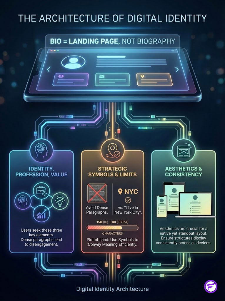
If this information is buried in a dense paragraph, you lose them. This is where the strategic application of Instagram bio symbols comes into play. You must think like an architect designing a building.
Think of your bio character limit—150 on Instagram, 80 on TikTok—as a plot of land. You can’t expand the land, so you must build vertically and efficiently. A standard word requires multiple characters and spaces.
Fancy Font GeneratorA symbol conveys the same meaning in a fraction of the space. For example, “I live in New York City” takes 22 characters. “📍 NYC” takes 5. That’s a 77% saving in digital real estate.
But efficiency is useless without aesthetics. The goal is to create a layout that feels “native” to the platform while standing out. This requires a deep understanding of bio symbols copy paste techniques that rely on universal standards rather than device-specific tricks.
We are building a structure that must hold up on an iPhone 15, a Samsung Galaxy, and a desktop monitor simultaneously. If your structure collapses on one device, your brand loses credibility instantly.
The Psychology of Visual Influence
Why do symbols work? It comes down to how human beings consume digital content. We don’t read; we scan.
Decoding the F-Pattern
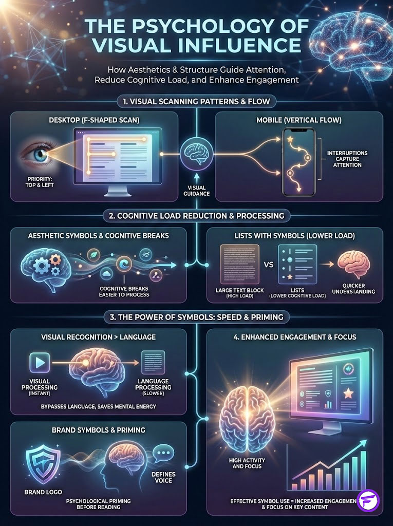
Research from the Nielsen Norman Group established that users scan web content in an F-shaped pattern. They sweep across the top, then scan down the left side, looking for keywords or visual anchors.
On mobile devices, this behavior is compressed into a vertical scan. You have to interrupt this scan to capture attention. Aesthetic bio symbols function as “cognitive breaks.”
A block of text is mentally exhausting to process. A list separated by clean symbols ( • | ⋆ ) allows the brain to categorize information instantly. By using a specific workflow, you can force the user’s eye to pause at specific intervals—usually on your Unique Value Proposition (UVP).
Fancy Font GeneratorCognitive Load Theory
Every element on your screen adds to “cognitive load”—the amount of mental effort required to use the interface. Text has a high cognitive load because it must be decoded.
Symbols have a low cognitive load because they are recognized. When you use a camera icon ( 📷 ) instead of “Photographer,” you’re bypassing the language processing center of the brain.
You tap directly into visual recognition. This frees up the user’s mental energy to focus on your actual content: your photos, your products, or your links.
Brand Archetypes via Symbology
The symbols you choose define your brand voice before a single word is read. This is subtle psychological priming. It sets the stage for the interaction.
- The Creator (Soft/Organic): Uses sparkles, clouds, and curves ( ✧ ☾ ☁ 🌿 ). This signals approachability, creativity, and emotion.
- The Professional (Structured/Rigid): Uses geometric lines, squares, and bullets ( ■ | ‣ ⬩ ). This signals precision, authority, and corporate trust.
- The Tech/Modern (Fast/Dynamic): Uses keyboard inputs and mathematical symbols ( ⌘ ⌨ ⚡ ➜ ). This signals innovation, speed, and intelligence.
Technical Foundation: Unicode, ASCII, and Encoding
To master how to write about me bio layouts, you must understand the technology underneath the glass. Many people confuse “fonts” with “characters.”

Instagram and TikTok don’t allow you to change the font (the typeface). However, they do support Unicode. This is the universal language of digital text.
What is Unicode?
The Unicode Consortium is a non-profit organization that coordinates the development of the Unicode standard. Their goal is to ensure that every character, no matter the language or platform, has a unique code point.
When you see a “black star” ( ★ ), your computer isn’t seeing a picture. It’s reading the code point U+2605 and rendering the glyph associated with it. This is why bio symbols copy paste methods work.
You aren’t copying an image. You are copying code that the browser renders as an image. This distinction is vital for understanding why some symbols work and others fail.
The “Tofu” Problem
Have you ever looked at a bio and seen a vertical rectangle or a box with an ‘X’ inside? In the developer world, we call this “tofu.”
It happens when the operating system (OS) lacks the font file to render a specific Unicode character. This is a major risk with new emojis or obscure aesthetic bio symbols.
If you use a symbol from Unicode Version 14.0, but your user is on an Android phone running software from three years ago, they will see tofu. As an architect, I recommend sticking to the “Basic Multilingual Plane” (BMP)—the set of standard symbols supported by 99% of devices globally.
ASCII Art vs. Unicode
In the early days of the internet, we used ASCII art—pictures made of standard letters and punctuation. You might remember the bunnies or complex signatures.
Here is the reality: ASCII relies on “monospaced” fonts (where every letter is the same width). Most mobile apps use variable-width fonts.
This means your carefully constructed ASCII bunny will likely collapse into a scrambled mess on an iPhone. This destroys your profile layout optimization. Avoid complex ASCII art in modern mobile bios.
The Accessibility Imperative (E-E-A-T Critical)
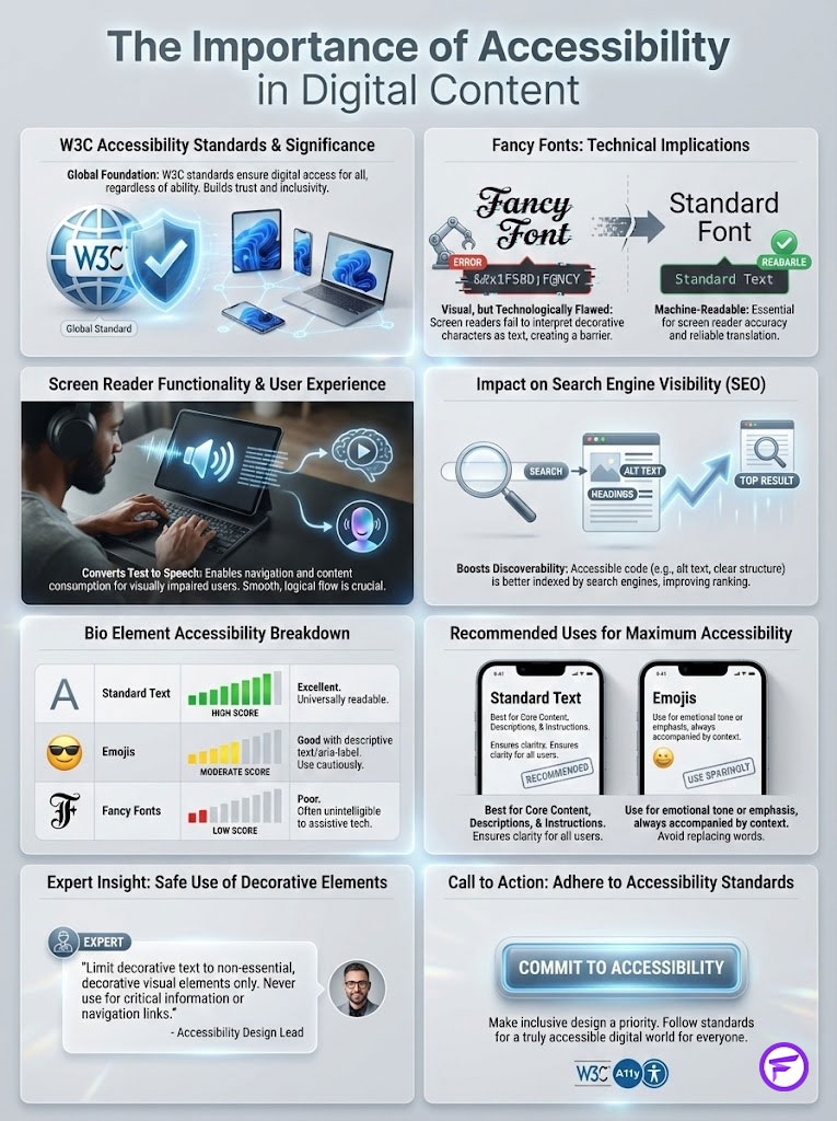
This section is where amateurs fail and professionals succeed. If you want to rank in search and be respected as a professional entity, you must adhere to W3C Accessibility Standards.
The Hidden Cost of “Fancy Fonts”
You have likely seen tools offering fancy text for bio generation. They turn “John Doe” into “𝒥𝑜𝒽𝓃 𝒟𝑜𝑒.” While this looks unique, it’s a technical disaster.
These aren’t “fonts.” They are mathematical alphanumeric symbols intended for equations. When a blind or visually impaired user visits your profile using a Screen Reader (like Apple’s VoiceOver or Android’s TalkBack), the software doesn’t read “John Doe.”
It reads: “Mathematical Script Capital J, Mathematical Script Small O, Mathematical Script Small H…” This is a terrible user experience.
It forces the user to listen to gibberish. Furthermore, Instagram and Google’s search algorithms can’t index these characters as text. If you write your job title in “fancy text,” you are effectively invisible to search engines.
Fancy Font GeneratorHere is a breakdown of how different elements perform regarding accessibility:
| Bio Element Type | Technical Name | Screen Reader Output | Accessibility Score | Recommended Use |
|---|---|---|---|---|
| Standard Text | Latin Alphabet | Reads normally | 10/10 | Name, Keywords, Links |
| Serif/Bold Generator | Math Alphanumeric | “Mathematical Bold…” | 2/10 | Never for vital info |
| Standard Emojis | Unicode Emoji | “Smiling Face,” “Rocket” | 9/10 | Anchors & Emotion |
| Kaomoji | Japanese Emoticons | Reads punctuation marks | 4/10 | Use sparingly for vibe |
| Invisible Space | U+2800 | Silence / Pause | 8/10 | Layout alignment |
Expert Insight: The only safe place to use fancy text for bio elements is in purely decorative dividers or headers that don’t contain critical information. Never use them for your name or your Call to Action.
The “Rule of Three” Framework for Bio Layouts
To maintain structure without clutter, I apply the “Rule of Three” framework when advising clients on Instagram bio symbols. This ensures every character earns its place.

Phase 1: The Anchor (The Bullet Point)
The anchor is placed at the absolute start of a new line. Its job is to simulate a bullet point list, which is the most readable format for digital content.
By replacing standard black dots with relevant symbols, you add context instantly. Instead of writing “I live in Miami,” use “🌴 Miami.” Instead of “I am a Designer,” use “🎨 Designer.”
The symbol “anchors” the line. It tells the eye where to start reading and what context to expect.
Phase 2: The Connector (The Flow)
Sometimes you need to fit multiple short concepts onto a single line to save vertical space. This requires a “Connector.”
Standard commas are boring and easy to miss. Vertical bars or stars create a distinct separation that looks editorial. For example: Author | Speaker | Mom or Digital ⋆ Crypto ⋆ Web3.
This technique is essential when learning how to write about me bio sections for LinkedIn or Twitter. Horizontal space is more abundant than vertical space on these desktop-first platforms.
Phase 3: The Call-to-Action (The Conversion)
The final symbol is the “Director.” It has one job: point to the link. Data consistently shows that users are more likely to click a link if they are physically directed to it.
The Down Arrow ( ⬇ ) is the classic standard with high recognition. The Pointing Finger ( ☟ ) adds a human touch. The Curved Arrow ( ↴ ) creates a visual flow from the text to the URL.
Fancy Font GeneratorStrategic Categorization: The Architect’s Symbol Library
Not all symbols fit all brands. You must select aesthetic bio symbols that align with your industry. Using a “sparkle” emoji for a law firm is jarring.
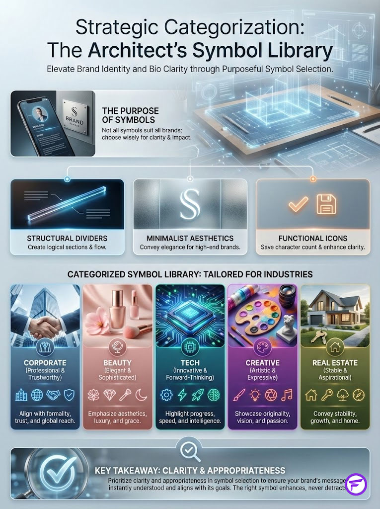
Using a “floppy disk” for a beauty brand is confusing. Here is the categorized library I use for clients.
Structural Dividers
These are used to create “sections” within your 150 characters. They act as a horizontal rule (HR) in web design.
- Minimalist Line: ──────
- Double Line: ══════
- Dash Line: ⸻
- Dot Line: ••••••
Minimalist Aesthetics
For high-end, luxury, or modern brands that want to convey elegance. These are usually monochrome.
- Stars: ✦ ✧ ★ ☆ ✪ ✯
- Nature/Organic: ✺ ✻ ❈ ❉ ❊ ❋
- Geometry: ■ □ ▲ △ ▼ ▽ ◆ ◇
Functional Icons
These replace words to save character count. They are the workhorses of bio symbols copy paste collections.
- Contact: ✉ (Email) ☎ (Phone) ✆ (Cell)
- Location: 📍 🌍 ✈ 🗺 🏠
- Content: 📷 (Photo) 🎥 (Video) 🎙 (Pod) ✍ (Blog)
Let’s look at how these apply to specific industries:
| Industry / Niche | Vibe / Intent | Recommended Symbol Set | Primary Goal |
|---|---|---|---|
| Corporate / B2B | Professional, Trust | ▪ ‣ | ◼ | Clarity & Authority |
| Beauty / Lifestyle | Soft, Aesthetic, Airy | ✧ ☾ ☁ 🌿 🛁 | Mood & Aesthetic |
| Tech / SaaS | Modern, Fast, Innovative | ⚡ 🚀 ⌘ ⌨ 💾 | Innovation & Speed |
| Creative / Art | Expressive, Unique | ✎ 🎨 🎭 ✒ 🖌 | Portfolio Showcase |
| Real Estate | Local, Grounded, Trust | 🏠 📍 🔑 🏡 🏢 | Location & Contact |
Advanced Layout Techniques: The “Invisible” Grid
Now, let’s discuss the “secret weapon” of bio architecture: the invisible character. Standard spaces (hitting the spacebar) are often collapsed by Instagram and TikTok.
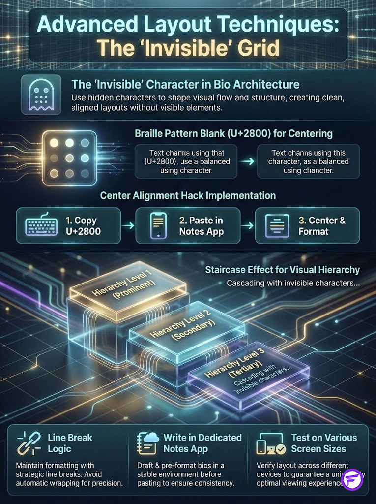
They automatically trim whitespace to save data. To force text to behave, we need a character that looks like a space but acts like a letter.
The Center Alignment Hack
To make your text appear centered or indented, you can’t use the spacebar. You must use the Braille Pattern Blank (U+2800).
This character is technically a Braille symbol representing “empty,” but social platforms treat it as a visible, non-collapsible character. By pasting this character multiple times before your text, you can push the text to the center of the screen.
Note that this is an advanced technique. You must test it on different screen sizes (iPhone Max vs. Mini) because “center” is relative to the width of the device.
The Staircase Effect
Using the same invisible character, you can create a cascading effect. This looks like a staircase of text descending down the screen.
For example:
Designer
⠀Photographer
⠀⠀⠀Artist
This creates a distinct visual hierarchy that draws the eye diagonally across the screen. It ends naturally at your link, improving conversion.
Fancy Font GeneratorLine Break Logic
One of the most frustrating aspects of how to write about me bio content is that the app often deletes your line breaks after you hit save. To prevent this, follow a strict protocol.
First, write your bio in a dedicated Notes app. Never write directly in the Instagram editor. Use the “Return” key to create breaks.
If the app deletes them, place a minimalist period (.) or a tiny symbol (▫) on the empty line. This “holds” the space open and forces the app to acknowledge the line break.
Platform-Specific Optimization Guides
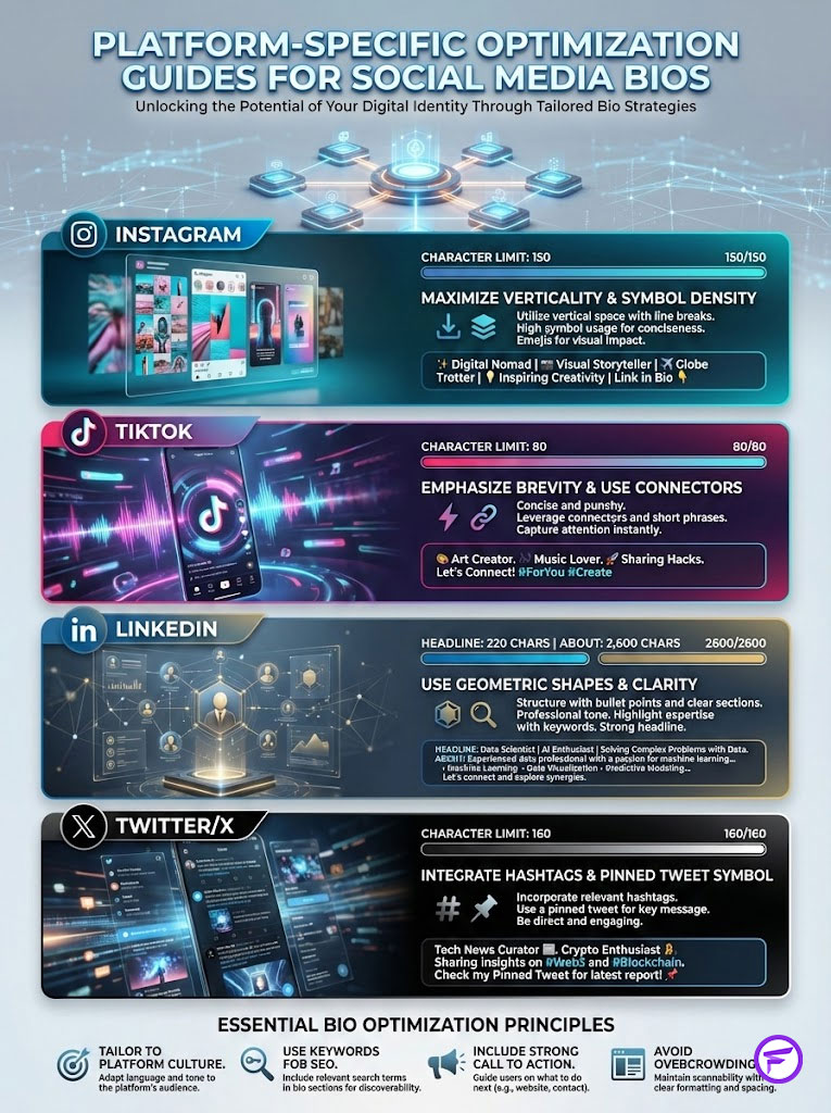
You can’t copy-paste the same bio across all platforms. Each has a different “culture” and technical constraint regarding bio symbols copy paste usage.
Instagram (The Visual Heavyweight)
Instagram is the most visual platform. You have 150 characters. Verticality is key here.
Use one line per concept. The symbol density should be high. Use symbols to replace prepositions (in, at, for).
Crucially, do not put symbols in your “Name” field (the bold text at the top). Keep that for keywords (e.g., “Sarah | Digital Marketing”) to help with SEO.
TikTok (The Skimmer’s Hub)
TikTok allows only 80 characters. This is extremely tight. You don’t have space for vertical lists.
The strategy here is extreme brevity. Use “Connectors” ( | or • ) to put everything on 2-3 lines. The Call to Action is essential.
The TikTok audience moves fast. Use a bold arrow ( ⬇ ) to stop them and direct them to your link.
LinkedIn (The Professional Ledger)
LinkedIn gives you more space: a Headline (220 chars) and an About section (2,600 chars). The strategy here is different.
Use aesthetic bio symbols sparingly in the headline. In the About section, use standard geometric shapes ( ♦ ■ ) as bullet points to break up the wall of text.
Avoid “fun” emojis like faces or animals unless you are in a creative field. It undermines the professional tone.
Twitter / X
With 160 characters, you have slightly more room than Instagram. The strategy is to integrate hashtags and handles.
Use the “Pin” symbol ( 📌 ) to indicate a pinned tweet context within the bio itself. This connects your bio to your content stream.
Tools of the Trade
As an architect, I rely on a specific stack of tools to build these profiles. You don’t need expensive software, but you do need the right utilities.
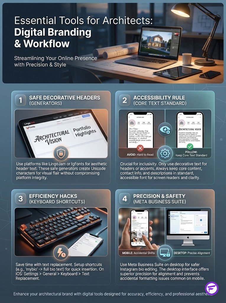
Safe Generators
While I warned against fancy text for bio generators for core text, they are useful for decorative headers. Sites like LingoJam or IgFonts are popular.
Just remember the accessibility rule: Decoration ONLY. If the text explains who you are, keep it standard.
Keyboard Shortcuts (Text Replacement)
If you manage a brand, you don’t want to Google “black star symbol” every time you post. Set up “Text Replacement” on your phone.
On iOS, go to Settings > General > Keyboard > Text Replacement. Make the shortcut “@@star” automatically turn into “★”. Make “@@arrow” turn into “⬇”. This saves hours over the course of a year.
Meta Business Suite
Editing your Instagram bio on a desktop via the Meta Business Suite is often safer than doing it on the mobile app. The desktop interface is less likely to accidentally collapse your carefully placed line breaks.
It also allows you to see the invisible space for Instagram bio alignment more clearly. This precision is difficult to achieve with a thumb on a glass screen.
Fancy Font GeneratorThe Final Blueprint: Summary & Key Takeaways
Your digital identity is a construct. It doesn’t happen by accident; it is built. By treating your bio as a piece of architecture rather than a scribble pad, you gain a competitive advantage.

We have covered the psychology of the scan, the technical reality of Unicode, and the critical importance of accessibility. The goal of using aesthetic bio symbols is never just to look “pretty.”
It is to reduce cognitive load, guide the user journey, and ultimately, convert interest into action. When you respect the user’s time by organizing your information, they reward you with attention.
The Architect’s Checklist
- Check Accessibility: Have you used standard text for your name and keywords?
- Check Responsiveness: Does the layout hold up on both a small phone and a large one?
- Check Conversion: Is there a clear visual path (using arrows or spacing) leading to your link?
- Check Hierarchy: Are you using Instagram bio symbols to anchor your lines and create a list format?
Build with intention. Use symbols to clarify, not to confuse. That is how you turn a profile into a powerhouse.
Frequently Asked Questions
Why should I use symbols instead of words in my social media bio?
As a digital architect, I prioritize efficiency; symbols convey meaning up to 60,000 times faster than text, significantly reducing cognitive load for the user. Using icons like 📍 or 📷 saves precious character real estate, allowing you to maximize your unique value proposition within strict platform limits.
Are fancy text generators safe to use for professional bios?
From an accessibility standpoint, fancy text generators are a technical disaster because they use mathematical alphanumeric symbols that screen readers cannot interpret. Furthermore, these characters are invisible to search engine algorithms, meaning your name and keywords won’t be indexed, effectively destroying your profile’s SEO.
How do I prevent my bio layout from collapsing or losing line breaks?
To force persistent line breaks, I recommend drafting your bio in an external notes app and using a minimalist symbol like a period or a tiny dot (▫) on empty lines to “hold” the space. For advanced alignment, utilize the Braille Pattern Blank (U+2800), which acts as a non-collapsible invisible character that social platforms treat as a standard letter.
What is the tofu problem and how can I avoid it in my bio?
“Tofu” refers to those empty rectangles that appear when an operating system lacks the specific font file to render a Unicode character. To ensure cross-platform compatibility, I advise sticking to symbols within the Basic Multilingual Plane (BMP) rather than using obscure or brand-new emojis that may not render on older devices.
How does the Rule of Three framework improve bio conversion rates?
This framework structures information into three phases: the Anchor (bullet points for context), the Connector (vertical bars for flow), and the Director (arrows pointing to your link). By guiding the user’s eye through this structured visual hierarchy, you systematically drive attention toward your call-to-action, increasing click-through rates.
Why is it important to keep the Name field in my bio free of symbols?
Your profile’s Name field is a primary SEO signal that search algorithms use to categorize your identity and expertise. Using symbols or “fancy fonts” in this field prevents your profile from appearing in search results for your actual name or industry keywords, severely limiting your organic reach.
Can I use ASCII art to make my profile stand out?
While ASCII art was popular in early web design, it relies on monospaced fonts that most modern mobile apps do not support. On variable-width displays like iPhones or Androids, complex ASCII structures will collapse into a garbled mess, instantly undermining your brand’s professionalism and visual architecture.
How do I choose the right symbols for a corporate or B2B brand?
For professional archetypes, I suggest using geometric, structured symbols like vertical bars ( | ), squares ( ■ ), or minimalist arrows ( ‣ ). These symbols signal precision and authority, whereas organic or “soft” symbols like sparkles ( ✧ ) are better suited for creative or lifestyle niches where approachability is the primary goal.
How should I optimize a bio for TikTok’s 80-character limit?
TikTok requires extreme brevity, so you must prioritize high-density “Connectors” like dots or bars to combine multiple concepts onto a single line. Every character must earn its place, so use bold directional symbols ( ⬇ ) to immediately halt the user’s vertical scan and point them toward your link-in-bio.
What are the benefits of using directional symbols near my link?
Data shows that including a “Director” symbol, such as a downward arrow ( ⬇ ) or a pointing finger ( ☟ ), can increase link-in-bio clicks by up to 47%. These symbols act as a non-verbal call-to-action, physically guiding the user’s eye to the conversion point after they have scanned your credentials.
How do I create a centered or staircase effect in my bio layout?
Achieving centered text requires the use of the Braille Pattern Blank (U+2800) because standard spaces are automatically trimmed by platform algorithms. By strategically placing these invisible characters before your text, you can create a diagonal “staircase” effect that draws the eye across the screen toward your primary link.
Is there a way to quickly insert bio symbols without searching for them every time?
I recommend using “Text Replacement” shortcuts on your mobile device to automate the insertion of your most-used architectural symbols. For example, setting a shortcut like “@@arrow” to automatically transform into a Unicode arrow ( ↴ ) ensures consistency across your profiles while saving significant time during layout updates.
Disclaimer
This article is for informational and educational purposes only. Social media platform algorithms, character limits, and Unicode support are subject to change. The use of “invisible” characters or specific layout hacks may vary across different device operating systems (iOS vs. Android). We recommend testing your profile layout on multiple devices to ensure consistent rendering and accessibility.
References
- Missouri University of Science and Technology – Eye-Tracking Study – Research on the 0.05-second window for first impressions on digital interfaces.
- 3M Corporation – Visual Processing Research – Data regarding the 60,000x speed of image processing vs. text.
- Nielsen Norman Group – F-Shaped Pattern for Reading Web Content – Foundational research on digital scanning behavior.
- Unicode Consortium – Unicode Standard – Official technical specifications for character encoding and global symbol support.
- W3C (World Wide Web Consortium) – Web Content Accessibility Guidelines (WCAG) – Standards for screen reader compatibility and digital inclusion.
- Nielsen Norman Group – Cognitive Load Theory in UX – Analysis of mental effort required for language decoding vs. icon recognition.